
Ararat Gallery TAMA
Ararat Gallery TAMA holds what’s thought to be the most comprehensive textile and fibre-based art collection in Australia.
— The Client
Ararat Gallery TAMA (Textile Art Museum Australia) holds what’s thought to be the most comprehensive textile and fibre-based art collection in Australia. The gallery works in collaboration with other high-profile institutions such as the NGV and Craft Victoria to present a broad and engaging exhibition program featuring innovative and contemporary textile art.
— The Brief
BrandWorks was engaged by Ararat Rural City Council to breathe fresh life into two important cultural institutions as part of an historic redevelopment of its Arts Precinct. The brief was to build two new, unique identities for Ararat Regional Art Gallery and Ararat Performing Arts Centre, highlighting the independence of each institution whilst maintaining a unity in overarching thinking. The gallery had existing branding so this was technically a rebrand.
— Our Approach
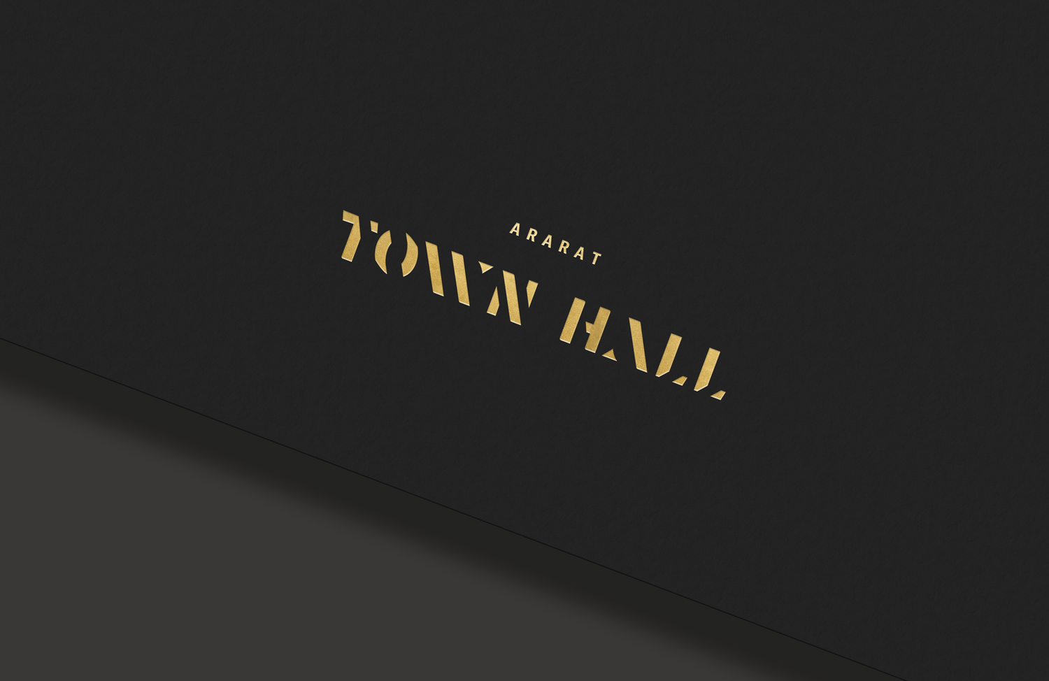
We studied the past, present and future of Ararat, exploring the tensions and harmonies between the new and old in the aim of finding a fresh direction for each brand while truly honouring their history. Keeping one foot in the past, we took inspiration from the stencilled wool bales that are ubiquitous in this wool growing district where “AAA” signifies high grade Merino. These three letters are conveniently present in the name Ararat, a visual gift we had fun leveraging. Both brands also move towards the future through a process of reduction and through pairing with contemporary typefaces from leading foundries.
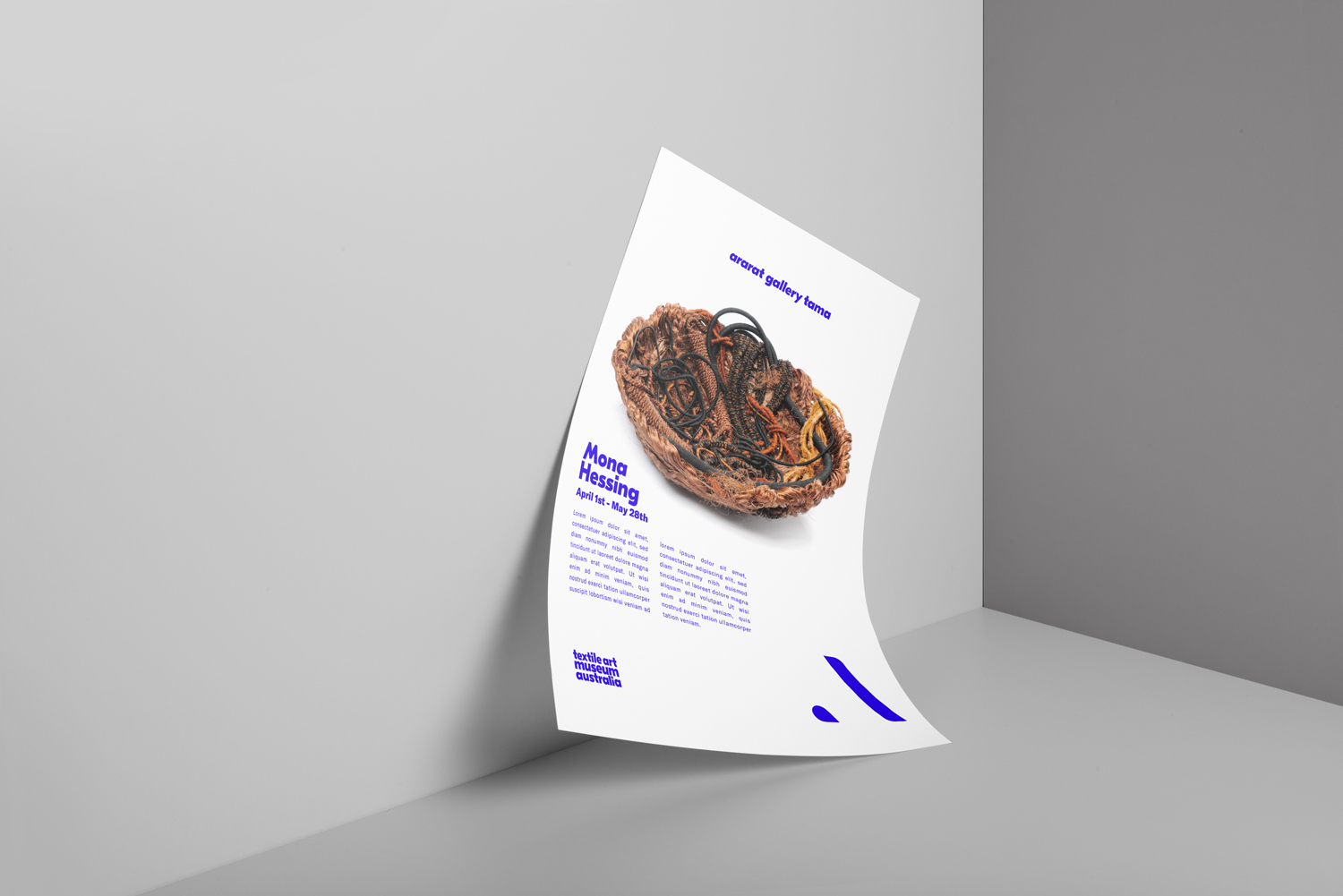
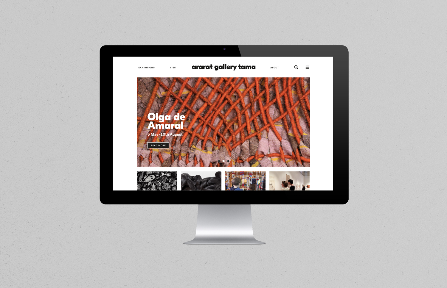
The Ararat Gallery TAMA brand system is a balance of authentic warmth and accessibility with engaging modern touches. The primarily rigid, monochrome palette becomes flexible and fluid as it responds to each exhibition through an intensely vibrant, playful supporting palette.
The biggest challenge of this project was to maintain the separateness of these two brands in look and feel while simultaneously creating visual and conceptual links between the unique entities. A shared, or rather overlapping, responsive colour palette was our primary solution to this challenge as well as the embedded relationship of the stencil idea within the typography.
— Challenges


Corporate identity and corresponding brand assets
Promotional and internal collateral design
Website, design and development
Signage, way finding, environmental graphics
— Outcomes
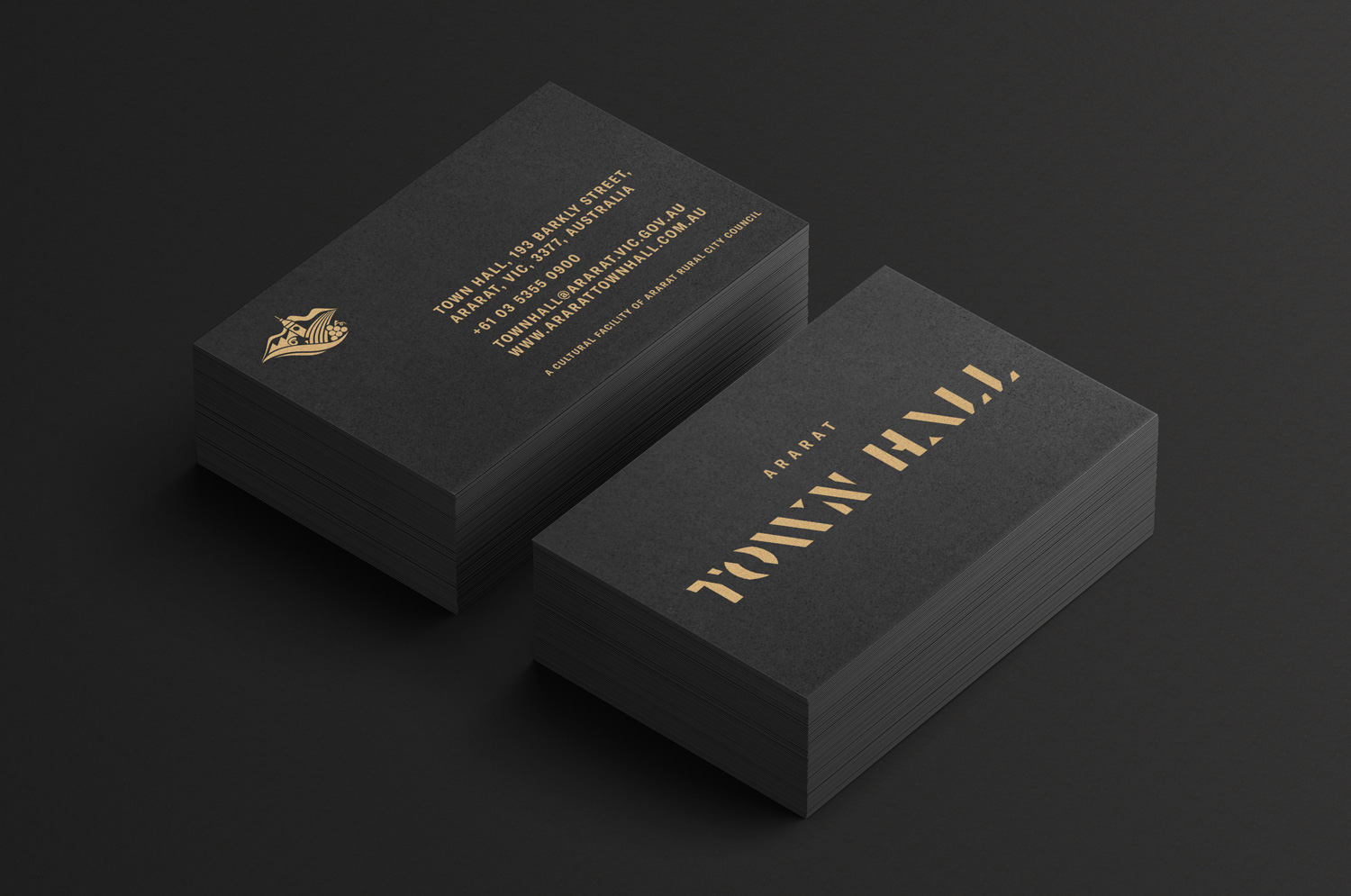
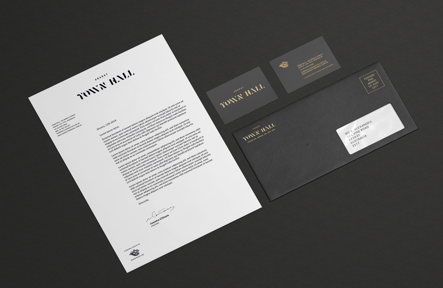
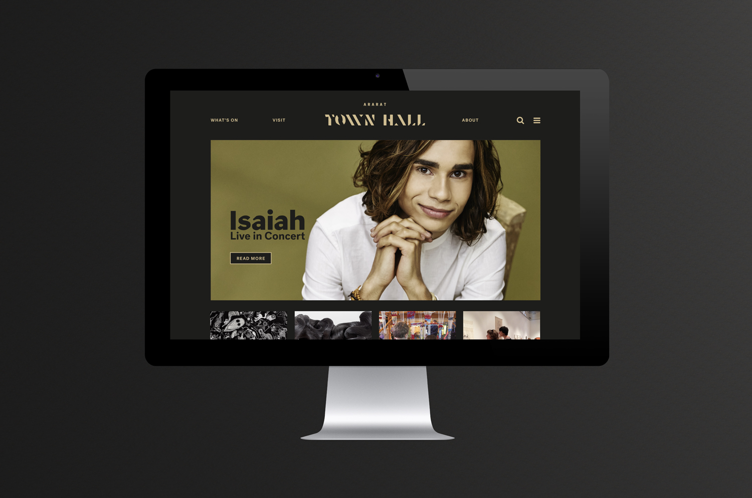
ARARAT TOWN HALL
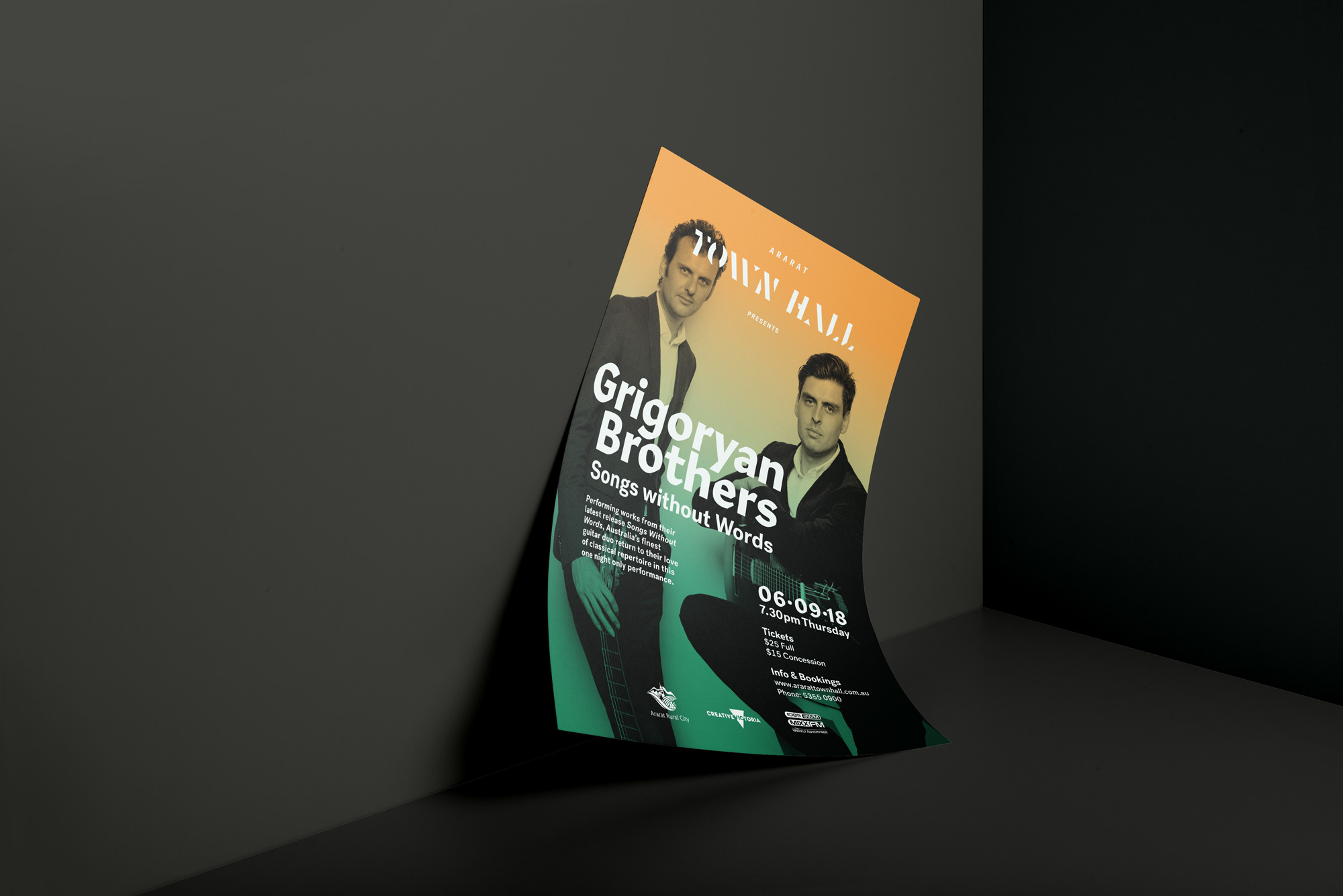
The Ararat Town Hall not only holds a prime position as a centrepiece of the streetscape of this regional city, it also holds a special place in the heart of the community.
The Ararat Town Hall not only holds a prime position as a centrepiece of the streetscape of this regional city, it also holds a special place in the heart of the community. It's the home of Ararat’s civic and cultural heritage and has acted as a performing arts centre since 1979. Ararat Town Hall now presents an extensive annual program of touring works of theatre and music as well as hosting local ensembles and eisteddfods.
— The Client
— The Brief
BrandWorks was engaged by Ararat Rural City Council to breathe fresh life into two important cultural institutions as part of an historic redevelopment of its Arts Precinct. The brief was to build two new, unique identities for Ararat Regional Art Gallery and Ararat Performing Arts Centre, highlighting the independence of each institution whilst maintaining a unity in overarching thinking. While the Gallery had existing branding to consider, the Town Hall was a blank slate.
We studied the past, present and future of Ararat, exploring the tensions and harmonies between the new and old in the aim of finding a fresh direction for each brand while truly honouring their history. Keeping one foot in the past, we took inspiration from the stencilled wool bales that are ubiquitous in this wool growing district where “AAA” signifies high grade Merino. These three letters are conveniently present in the name Ararat, a visual gift we had fun leveraging. Both brands also move towards the future through a process of reduction and through pairing with contemporary typefaces from leading foundries.
— Our Approach
— Challenges
The biggest challenge of this project was to maintain the separateness of these two brands in look and feel while simultaneously creating visual and conceptual links between the unique entities. A shared, or rather overlapping, responsive colour palette was our primary solution to this challenge as well as the embedded relationship of the stencil idea within the typography.
The theatre is a dramatically black, cavernous room, in stark contrast to the white, spacious, ‘blank canvas” walls of the art gallery. The palette is built directly from this notion of high contrast through a base of black and white (and gold in the case of the theatre). It then expands and adapts with vibrant saturated colours, applied as a gradient wash over photography, like coloured gel lights on stage in the case of the theatre, and as bright block colour drawn directly from artworks in the case of the gallery. This responsive palette allows for a fresh, ever changing, yet consistent visual treatment for seasonal promotional material and links the two entities visually and conceptually, while maintaining their independence.
Corporate identity and corresponding brand assets
Promotional and internal collateral design
Website, design and development
Signage, way finding, environmental graphics