
Servants Community Housing, Melbourne
Strategy / Branding / Website
Human Kind.
Since 1986, Servants has worked tirelessly to provide safe, comfortable and affordable housing for people at risk of homelessness across the City of Boroondara in Melbourne’s East. They now manage four houses which around 100 residents call home.
Click play to view.
Background
From the start, Servants has strived to provide much more than just a roof over people’s heads, with a desire to create meaningful connections that benefit residents, volunteers and the wider community. One of the unique aspects of Servants’ model is their live-in house managers, who provide an essential human connection to the residents - even in something as simple as a cup of tea and a chat.
Their secondary goal is to improve community engagement and education more broadly around issues such as homelessness, drug use and mental illness. In their own words, their mission is to create “a caring, genuine and generous community devoted to promoting respect, dignity, hope, and opportunity”.
Servants approached BrandWorks to develop a new, revitalised brand identity, tone of voice and digital presence - with a new website at its heart. This will form the foundation of the next phase of their growth as they seek to expand their communities over the next 5-10 years.
Challenges
Servants’ existing brand identity had been developed in-house and had served the company well for many years, but had begun to suffer without an overarching brand strategy and a clear direction. One of our main aims was to respect the existing brand, and create a new identity that would be clean, modern and fresh - but still unmistakably Servants.
Another challenge lay in the target audience of the new brand. Given Servants’ unique position, their collateral and marketing materials needed to be equally comfortable and accessible to residents, volunteers, donors, stakeholders, and local communities. The breadth of the audience meant the brand identity needed to be flexible, adaptable and easy to roll out.


Solution
From our very first briefing, the same key values kept coming up again and again - community, respect, dignity, hope and opportunity. We built the new brand with these pillars at its core, and a focus on people - the people who make up Servants’ communities - rather than brick-and-mortar buildings. Photography plays a huge role in the brand, with imagery that is candid, authentic and life-affirming.
The palette is anchored by a deep navy blue - a nod to the previous brand. It is clean, professional, and balanced against an off-white to provide warmth and familiarity. From here the secondary palette branches off in a number of bright, optimistic hues that can be used in isolation, or combined to create an extremely flexible solution.
The secondary system again focuses on communication, featuring a framing device inspired by speech bubbles and line illustrations signifying connection.

With the new brand finalised, attention turned to the new Servants website, which was built from scratch to focus on making important information as clear and easily accessible as possible. Again, due to the nature of Servants’ audiences, the website needed to cater for different types of users, looking for different things.
The website is clean, elegant and responsive, using the brand palette and secondary elements to organise sections and content across the site. Prospective tenants can easily find key information about housing and make an application. Meanwhile, other visitors can easily find out more about what Servants do, get information about volunteering opportunities, or make a donation.
With a new brand and website, Servants is now positioned ideally to develop, expand and help many more people across Boroondara over the next 10 years, and into the future. Further reading: ABC NEWS.
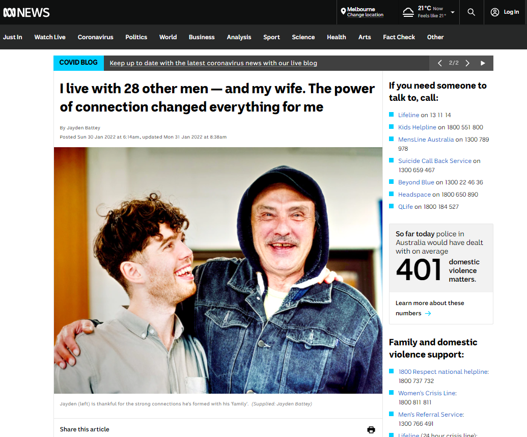
ABC NEWS: Servants Community Housing article. Posted 30.1.22