
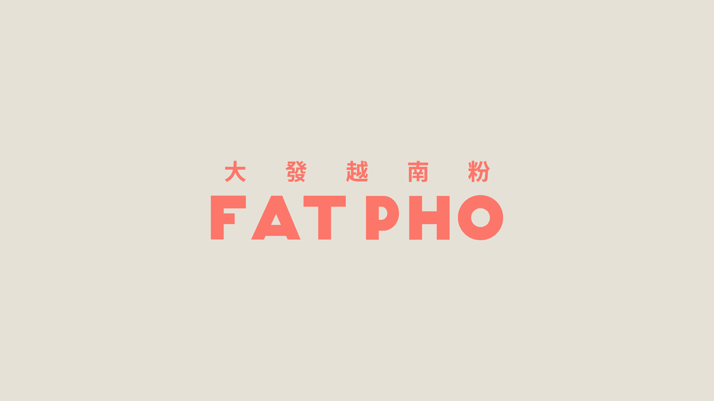
Fat Pho, Shanghai - China
Strategy / Branding / Packaging / Uniforms / Signage & Way-finding


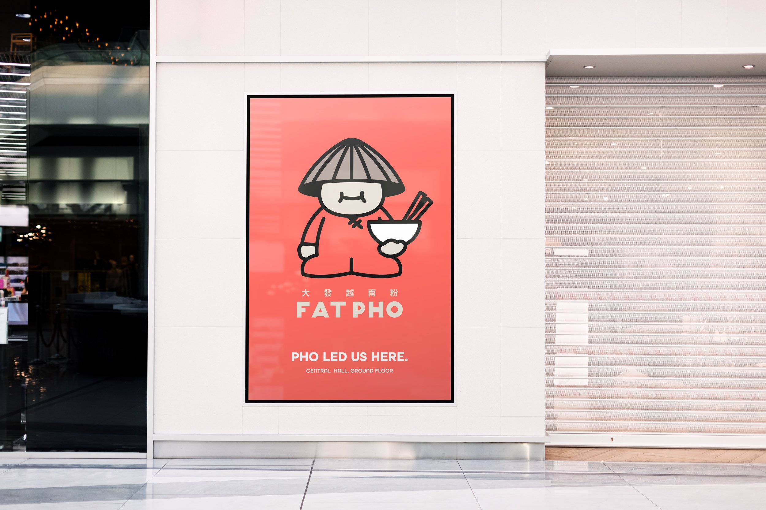
Pho Led Us Here..
Background
Spanning more than 30 years, fusing the culinary cultures of Vietnam, China and Australia, and with two generations of craftsmanship and innovation, Fat Pho's philosophy of consistent quality has resulted in a bowl of Vietnamese pho that speaks to the soul.
Fat Pho was born in Australia and raised in Shanghai. Since opening prior to Covid, the brand is still growing even in the midst of the Covid pandemic. It has grown to eight stores across China in less than three years.
BrandWorks was engaged to consolidate Fat Pho brand positioning in-market, brand story, and identity extension to propel its brand forward.
Approach
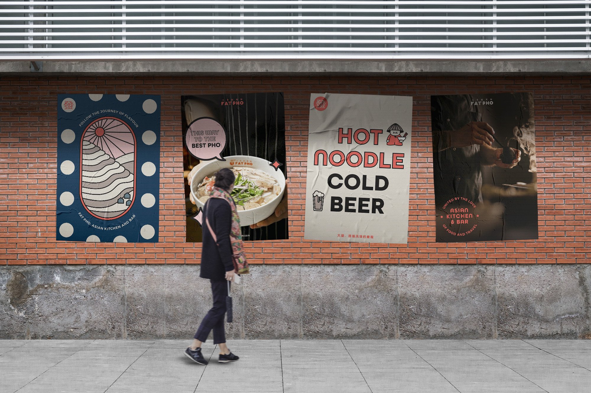
To differentiate from Fat Pho’s competitors in China, the story of Fat Pho was crafted around the idea of one person - Fat Pho, a tastemaker, traveller and global citizen of Asia. An explorer of food and purveyor of culture all in one. Guests would be invited to join Fat Pho’s adventure of food and flavour and finally finish up with a hearty bowl of his favorite dish, Vietnamese Pho noodles. So good in fact, his best mates likde to call him Pho. And so you should you.
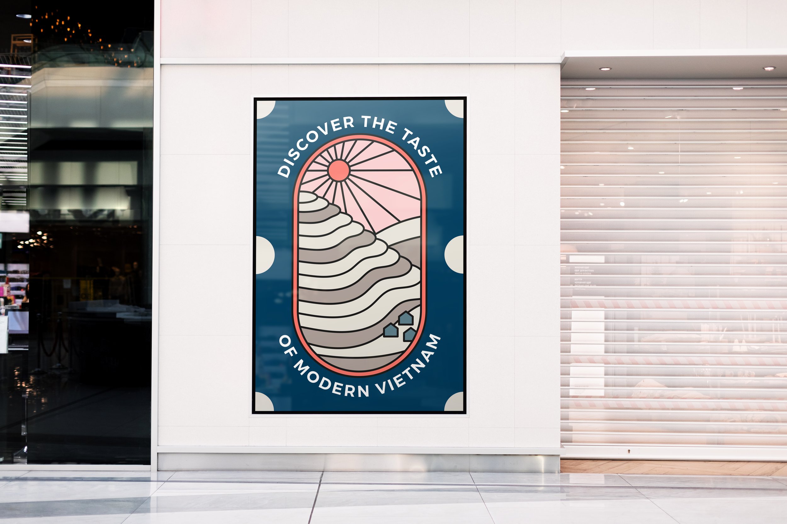
BrandWorks approached the brand using traditional Vietnamese elements but with a modern twist. The design elements are visually appealing, bold, and interactive to connect with their target audience. GenZ consumers are known for valuing authenticity, sustainability, and inclusivity, During the design development phase, the studio incorporated those elements into the brand's messaging to make it more front of mind.

Challenge
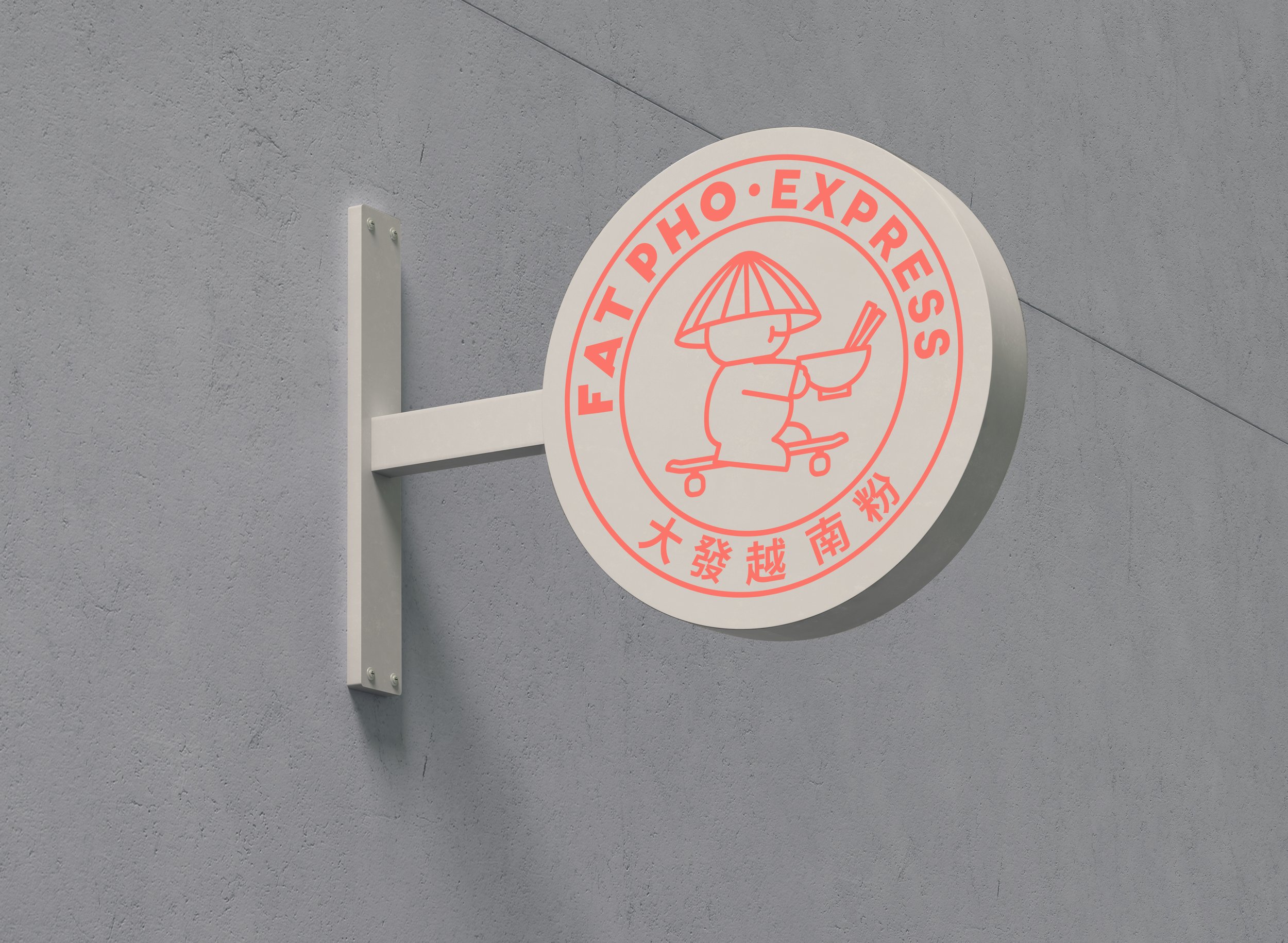
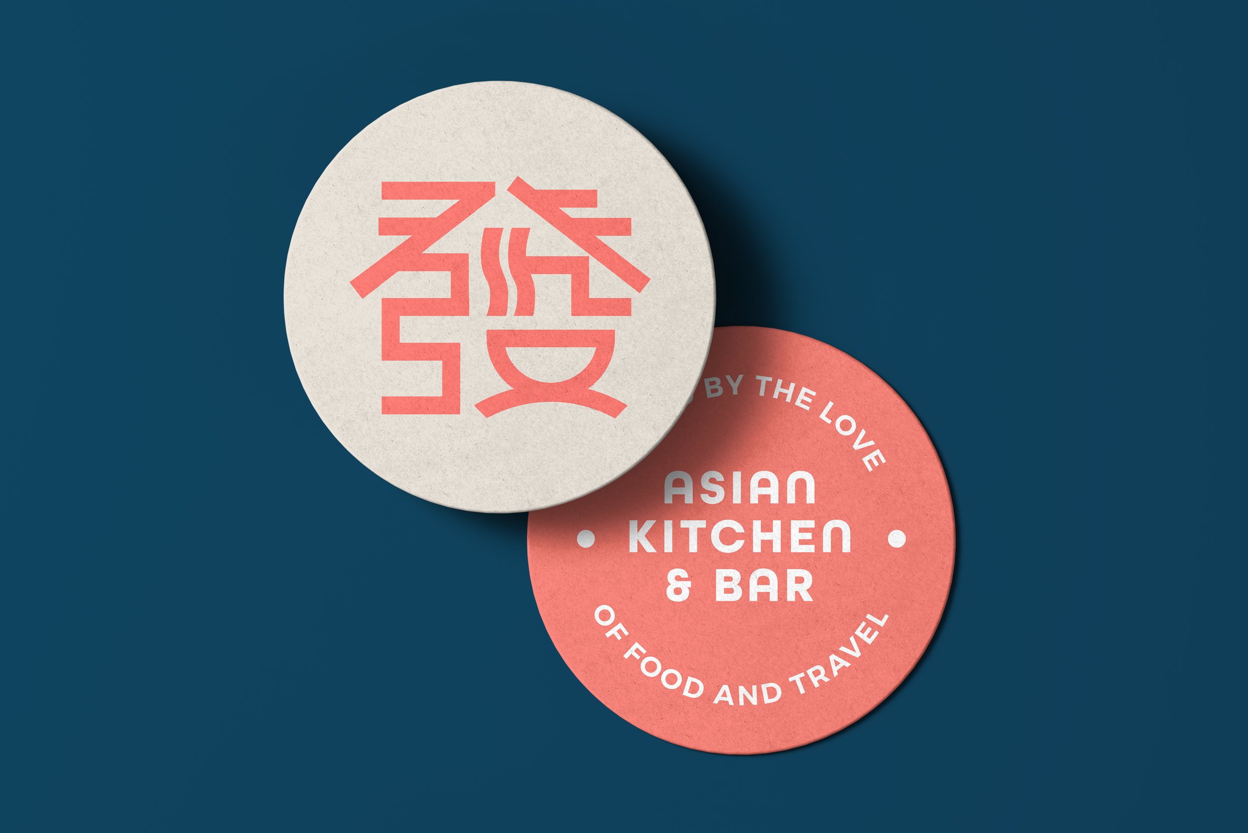
BrandWorks China was engaged to help build the brand by retaining the existing brandmark and two primary brand colours. The team needed to ensure any new elements introduced would tie in with existing and upcoming venues in its pipeline, without diluting the brand messaging or damage the brand’s image in market.
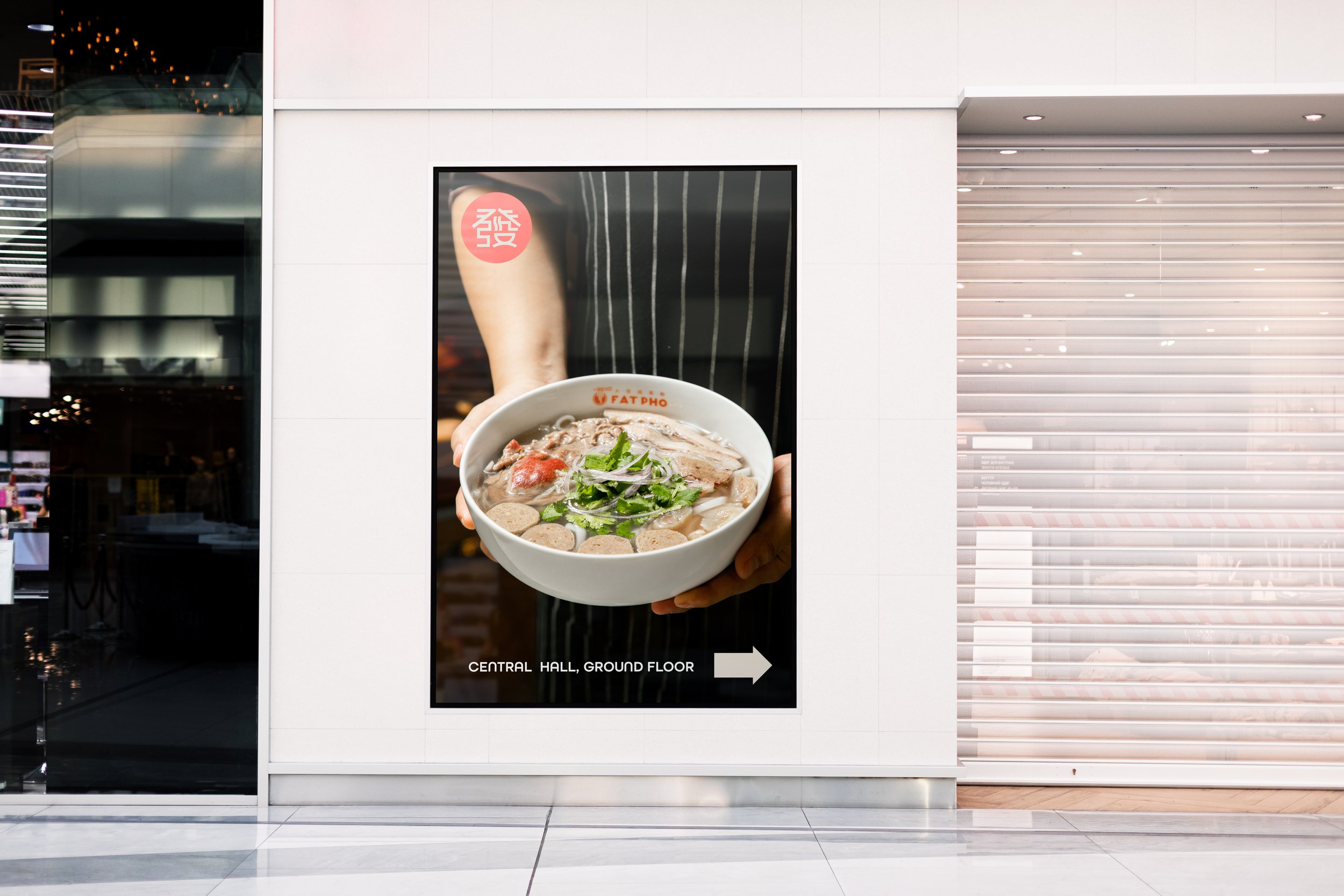
The Solution
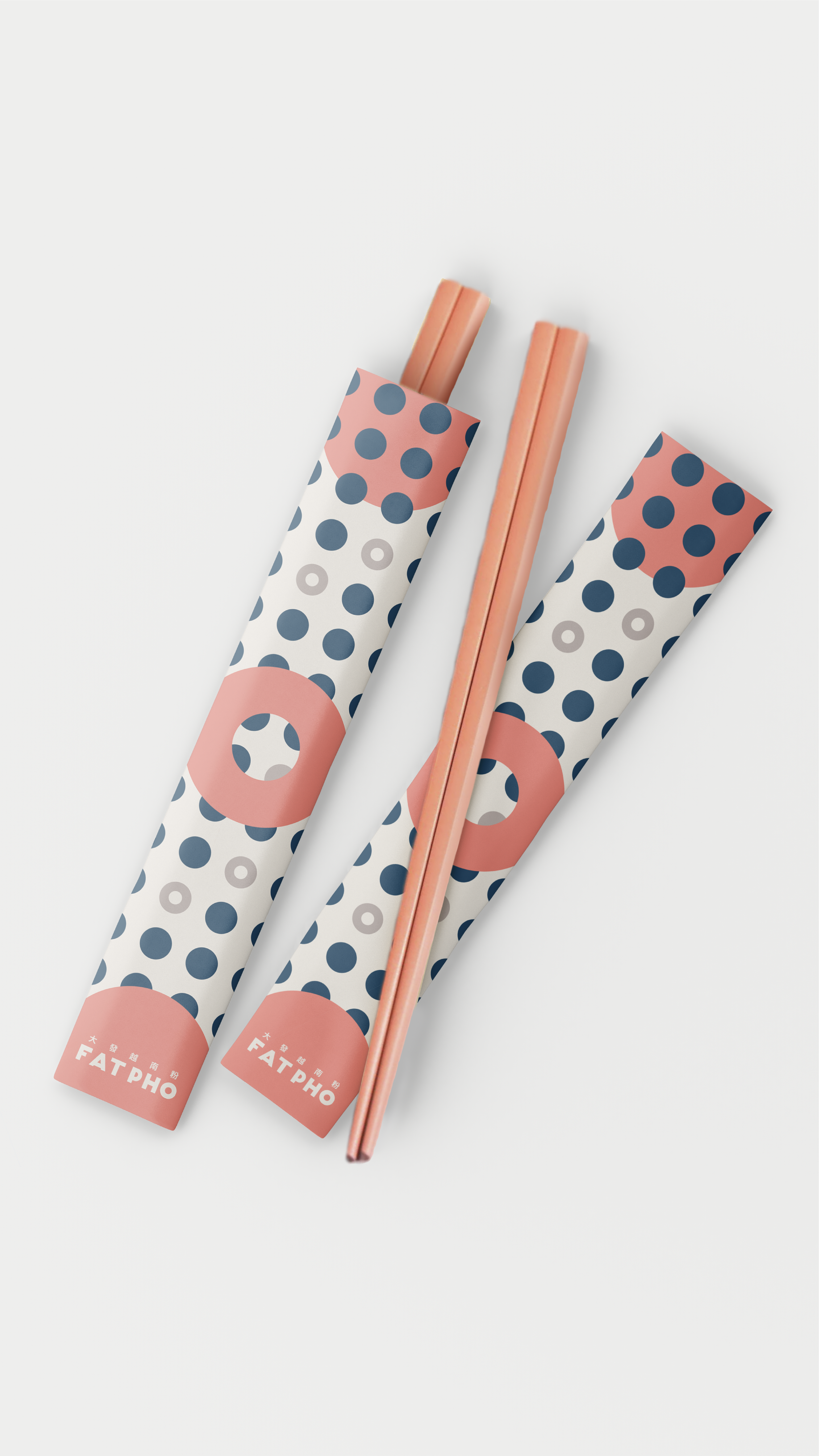
A selection of colours were introduced to balance the existing colours and to widen it’s appeal to both genders. The hero pattern was developed to echo the existing interior elements and will be applied to future store designs.


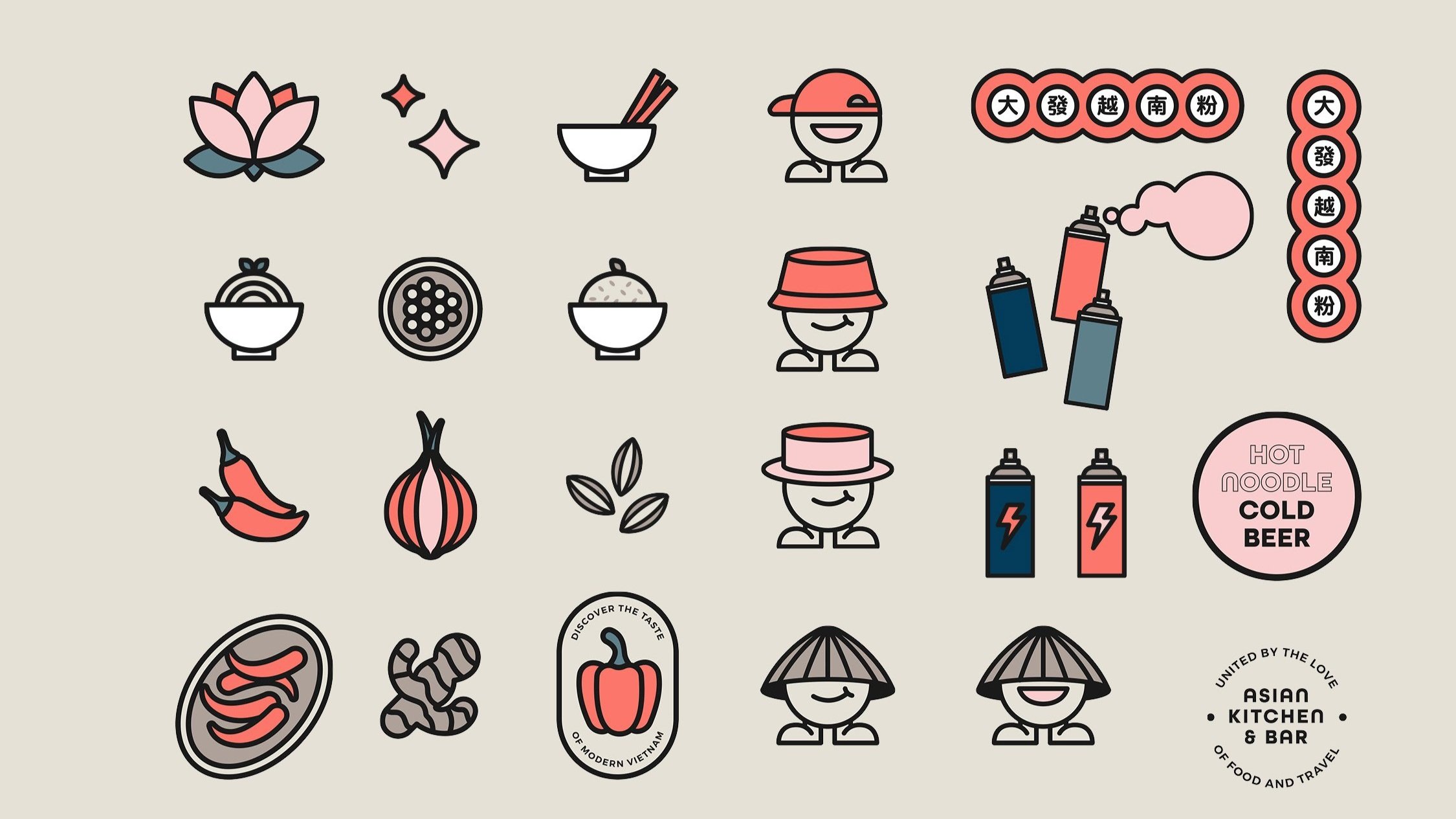
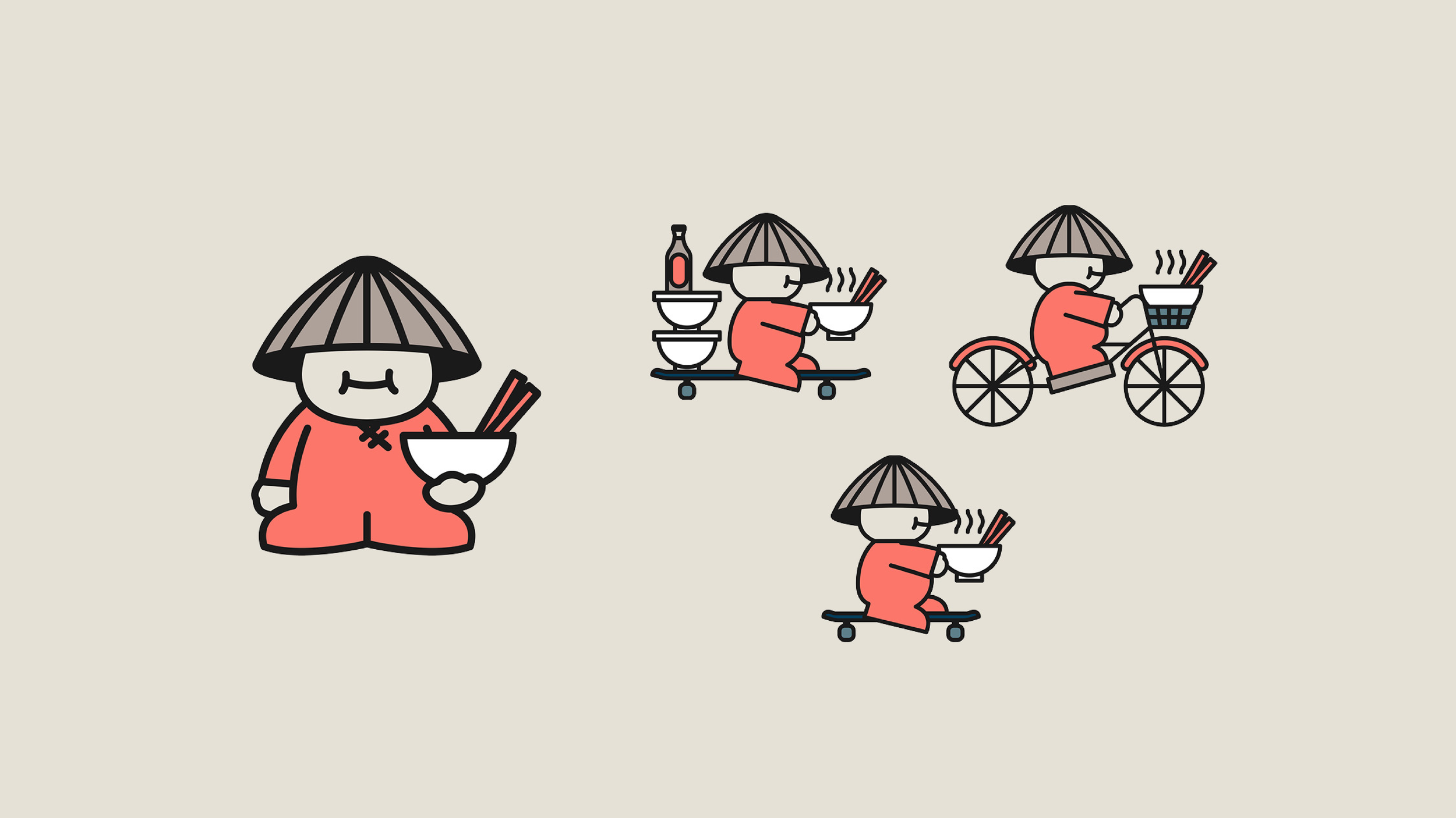
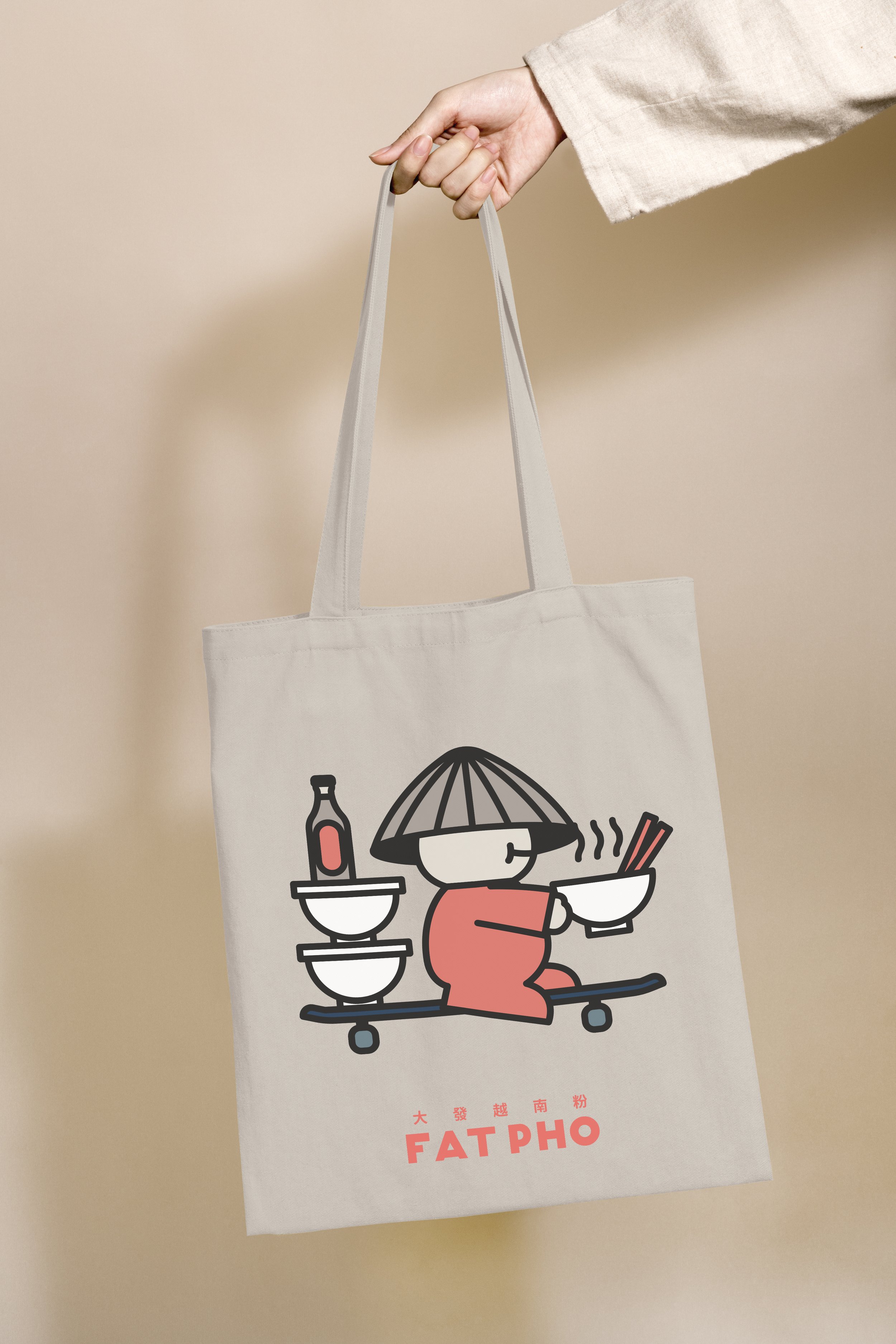
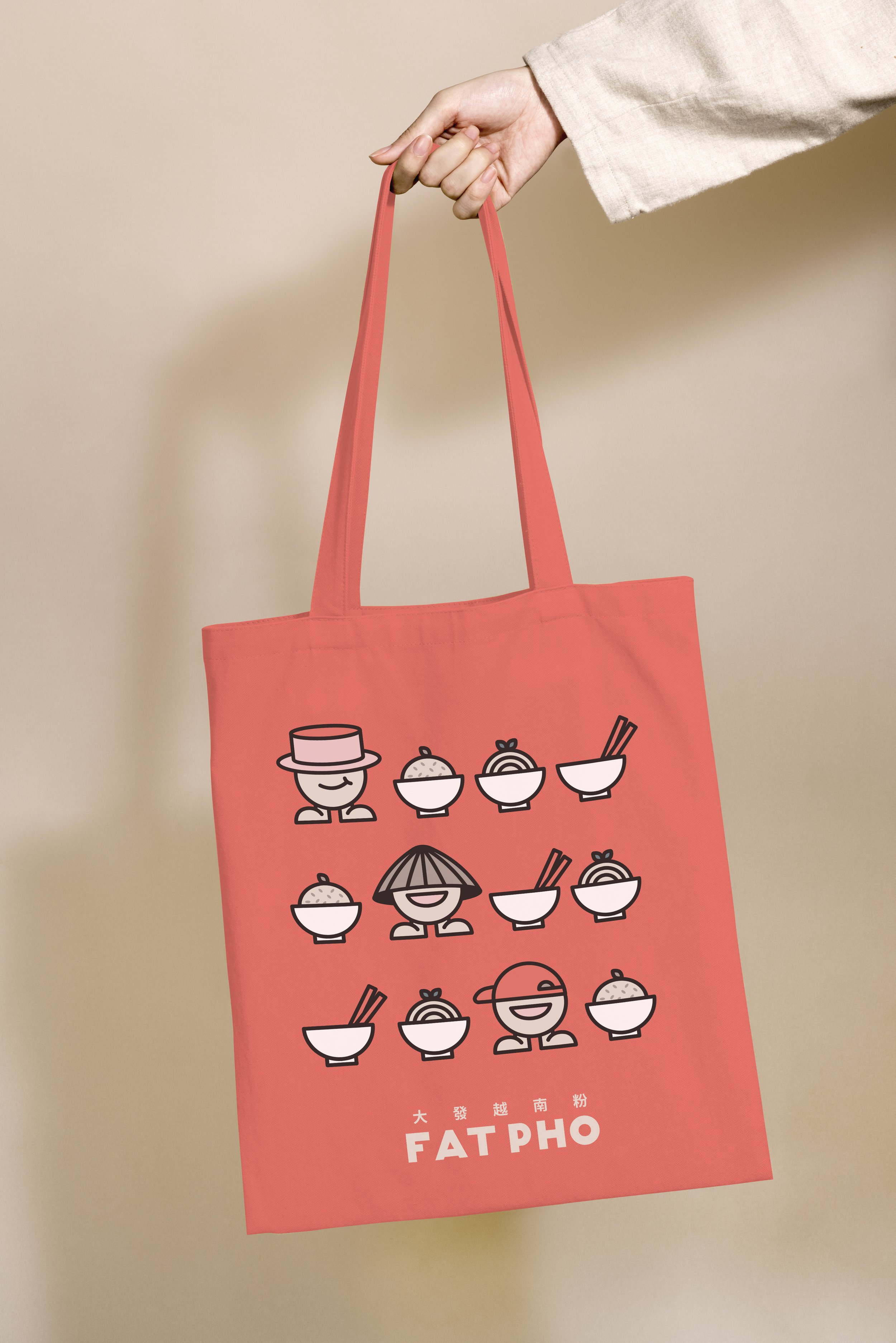
A series of mascots were created for Fat Pho to communicate the brand story and personality. It’s cheeky, cool mascot is a strong brand magnet designed to introduce Fat Pho to a wider audeince and is well used within its current marketing and promotions. The mascots help connect the brand to its new customers in a friendly and authentic way. The overall tone and visua identity has been finely tuned to appeal to a younger, discerning generation, with both offline and online touchpoints considered.

Result
Since China’s reopening of its borders and lockdown mandate in early January ‘23, Fat Pho has experienced rapid growth and buoyant demand for its premium dining and bar experiences. With such growth planned for new store rollouts in the next 12-18 months, its refreshed brand identity will help solidify its position as one of the rising hospitality groups, feeding the evergrowing appetite of global cuisines and world-class food for the rising middle class of China.


More:
WeChat Official Account: fatpho
微信公众号: FAT PHO大發越南粉