Pearl, Chablis & Oysters - MELBOURNE CBD
CONCEPT, INTERIORS, SIGNAGE & WAY-FINDING


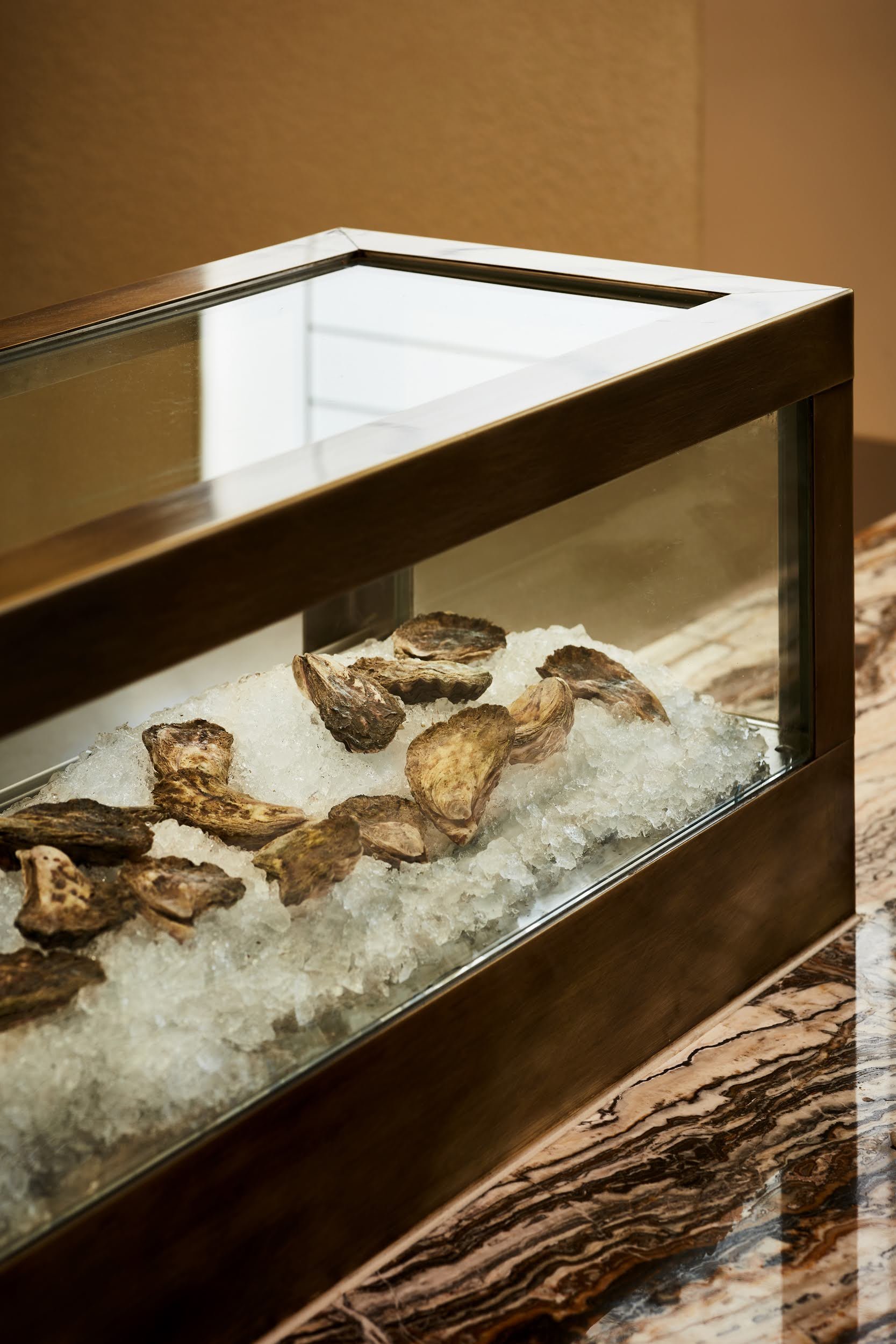
Pearl was born out of a love for the dry minerality of Chablis married with the creamy oceanic experience of Oysters.

The Brief
Our client Jeremy Schick (of Pinchy's lobster and champagne bar just next door) dreamt of a concept wine bar that championed another of his favourite pairings in the heart of Melbourne. The desire was for it to be bright, airy but exude warmth and sophistication, just like the produce.
“With such a unique and niche F&B concept, we knew we wanted to create more than just a wine bar. Pearl was to be a space that fully celebrated the symbiosis between Chablis and Oysters. The interior palette for Pearl therefore honours the characteristics of her premium offering that you experience on the tasting palette"
- Sophie, Lead Interior Designer

Challenges
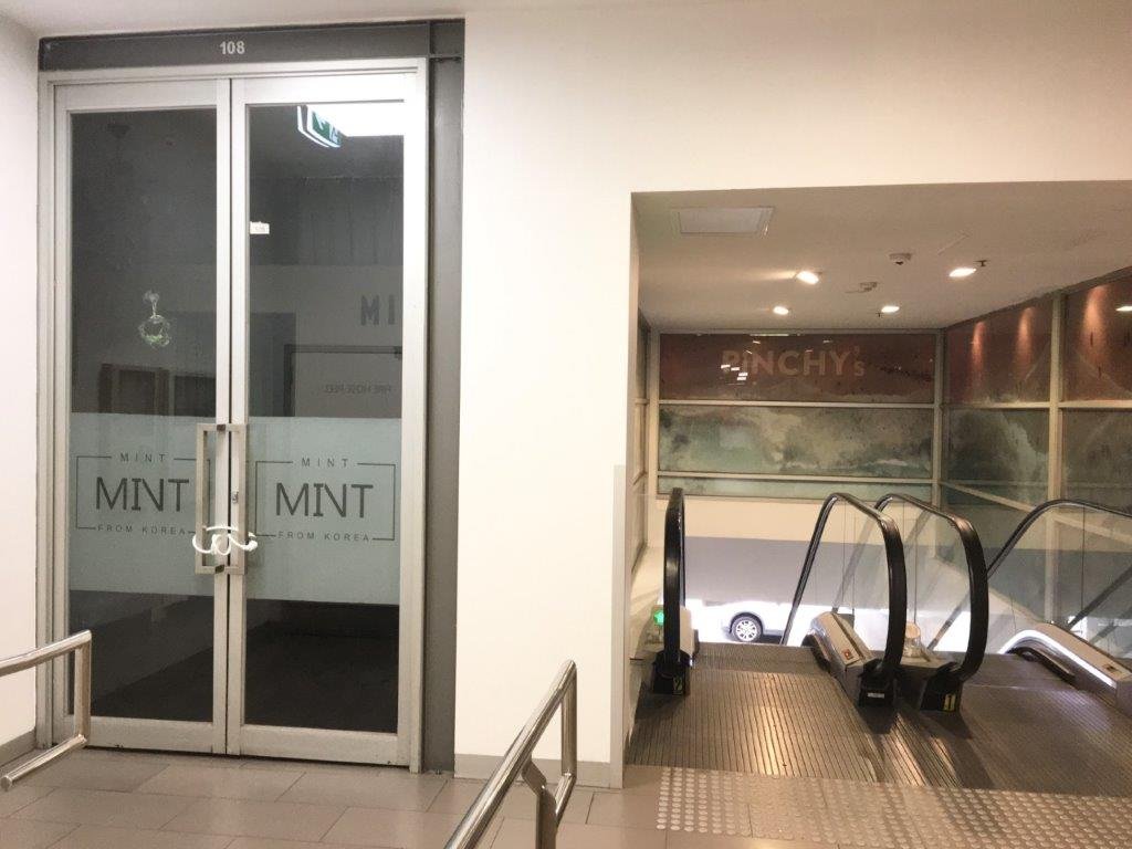
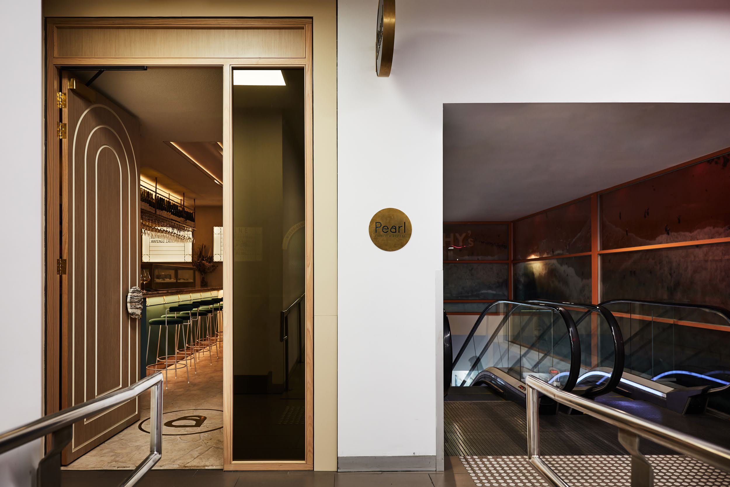
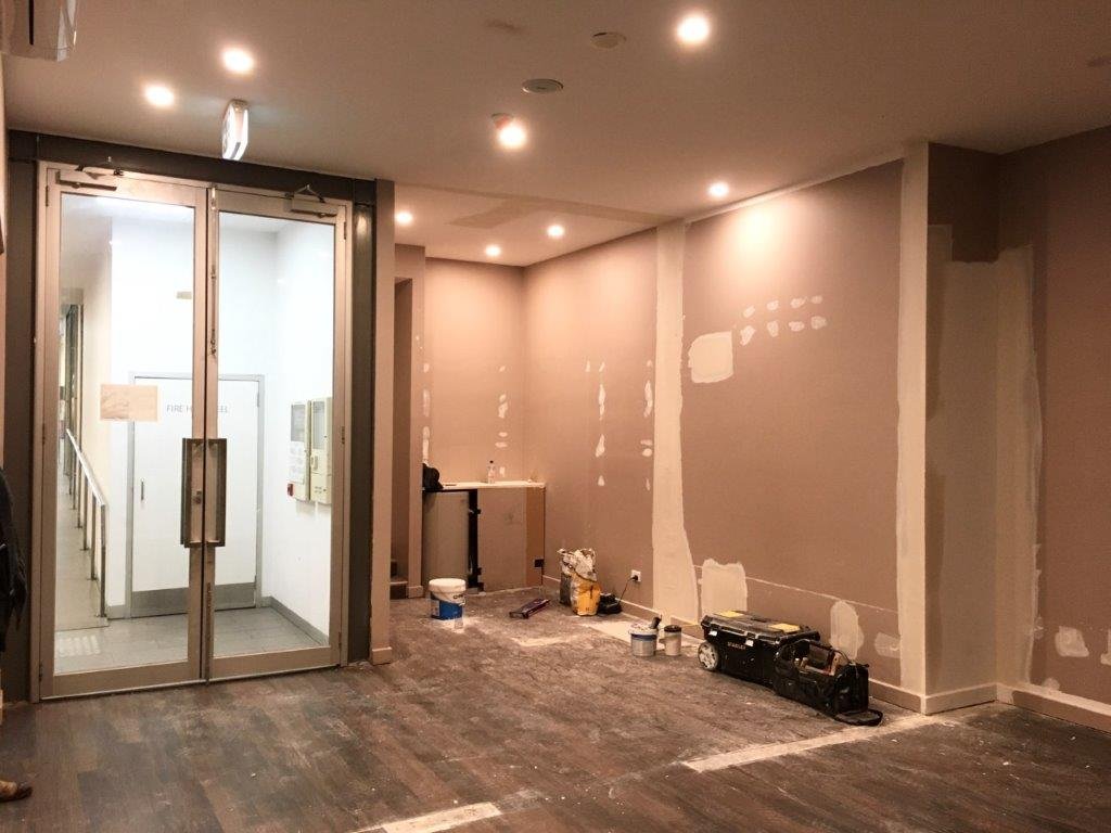
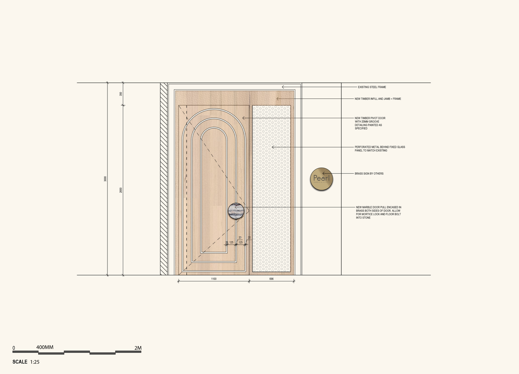
Our site was previously a retail tenancy on the first floor of Bourke Streets Mid City shopping centre. In order to inject a premium hospitality venue within this context, we needed to approach the functional design like a speakeasy. By shrouding the windows with joinery and perforated metal, we ensured we had complete control over the ambience without the garish light from the fluorescence outside.
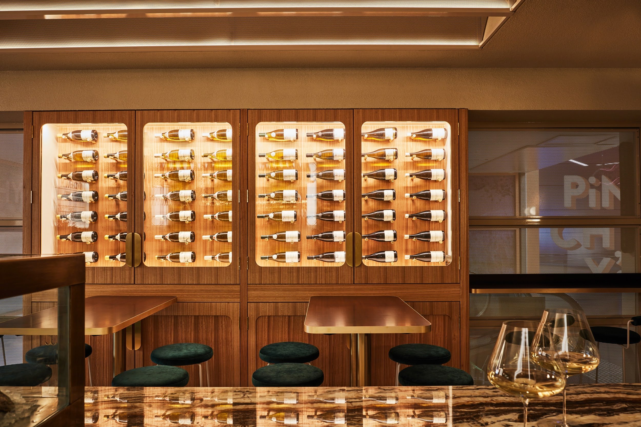
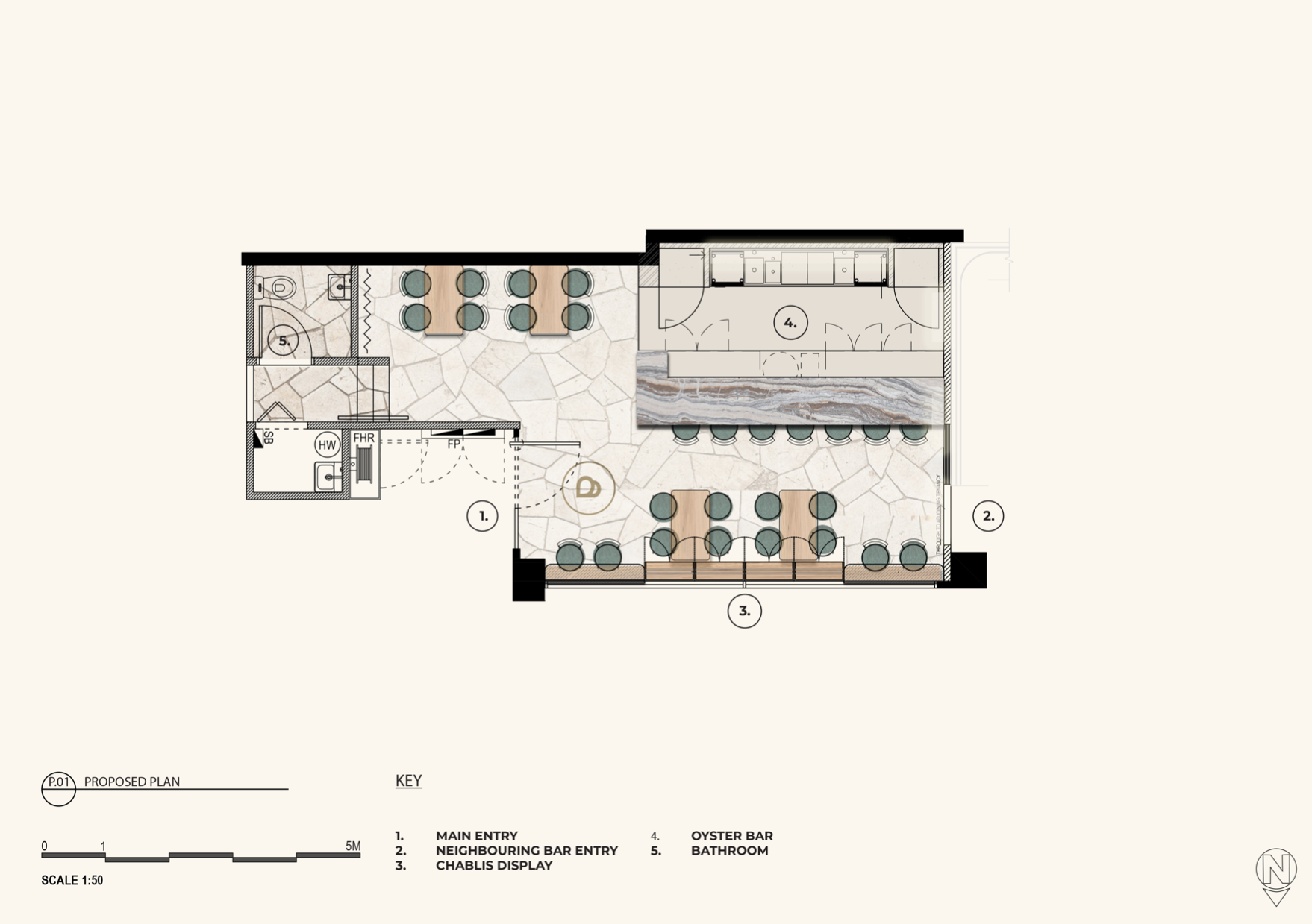
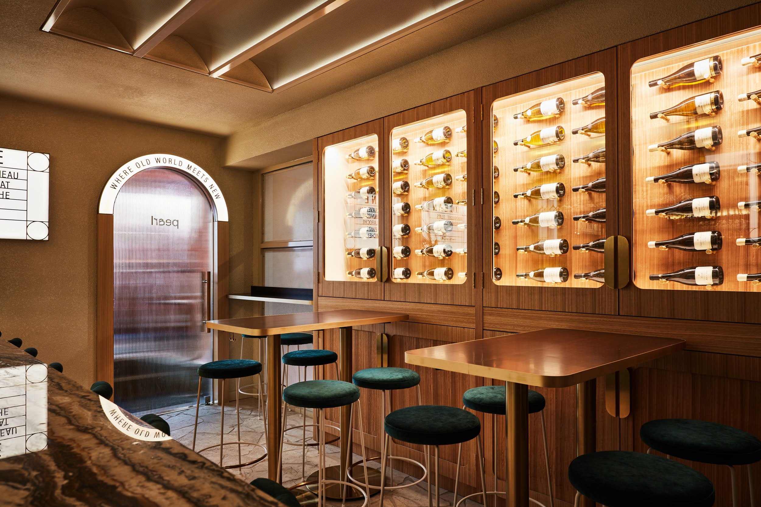
The tight footprint was also a significant challenge as we had an ambitious brief for only 45 square metres. This was tackled by placing the patrons up against the wine store and making the doors operable above bar height. A sliding fluted glass door allows Pearl to puncture through to Pinchy's which encourages cross-pollination between tenancies. By doing this the space is able to breathe and be more activated whilst creating even more intrigue between the two venues.
Our Approach
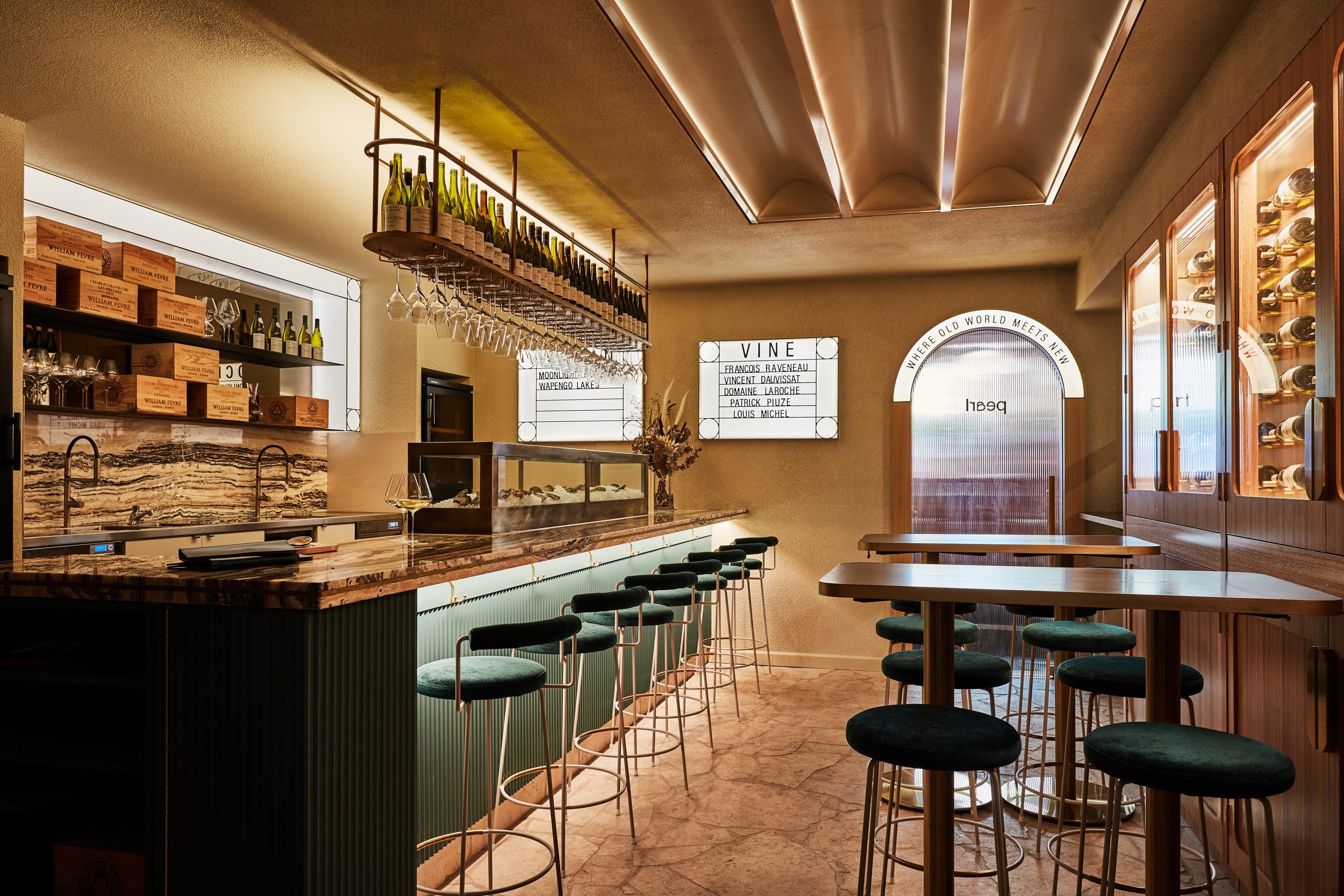
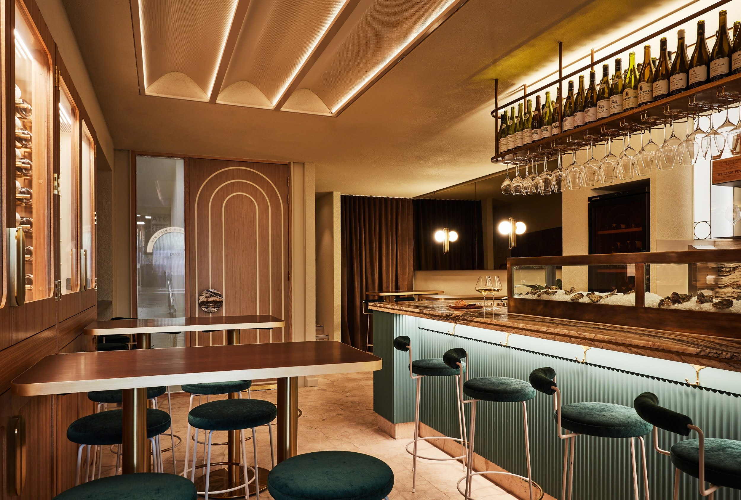
Dry, mineral and light-bodied with a finishes palette that exudes luminescence, Pearl encapsulates the essence of Chablis and Oysters. BrandWorks curated a speakeasy style space that was completely shut off from the external surroundings, helping build mystery and intrigue for patrons entering the world of Pearl whilst maintaining control of the interior feel, lighting and mood.
Inspired by the deep greens of the ocean and white luminescence of the cinque terre, Pearl challenges the idea of what a speakeasy bar should look like. It is bright and lofty without compromising on the feeling of intimacy.
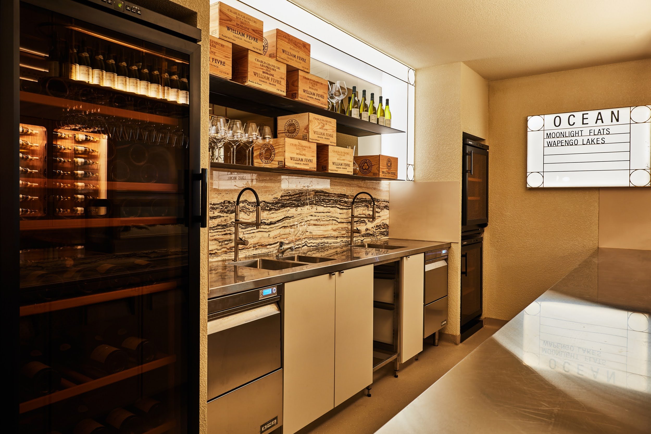
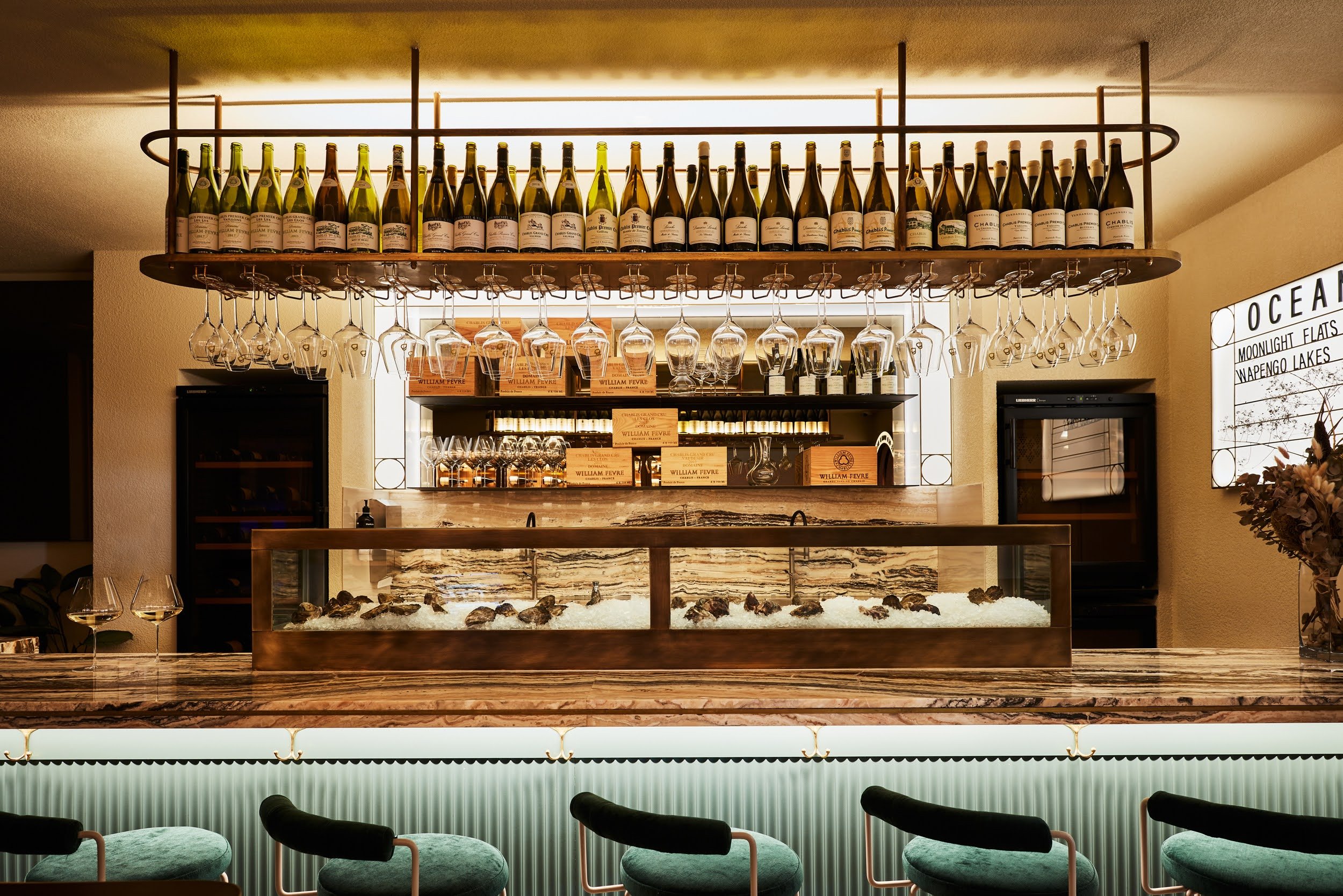
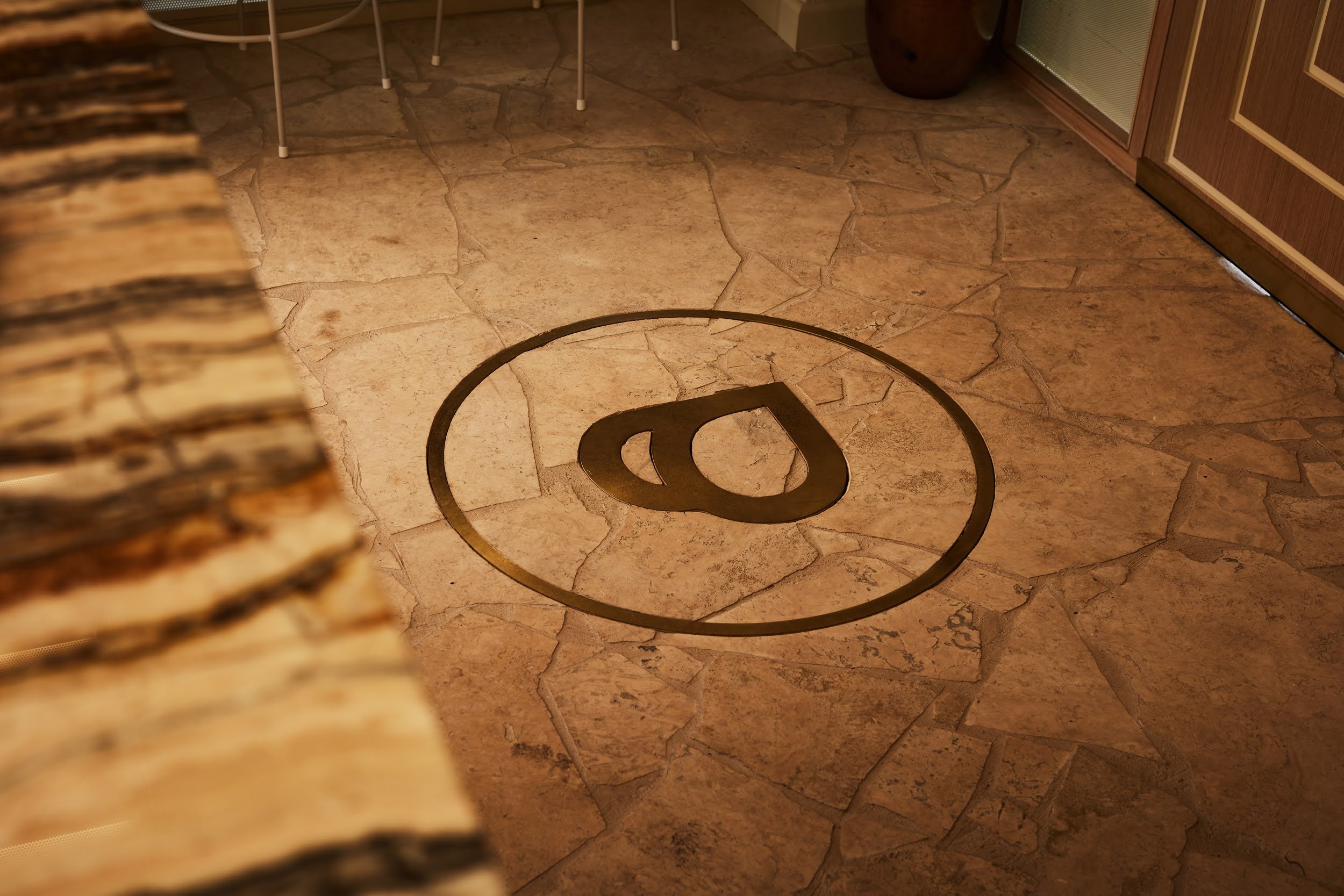
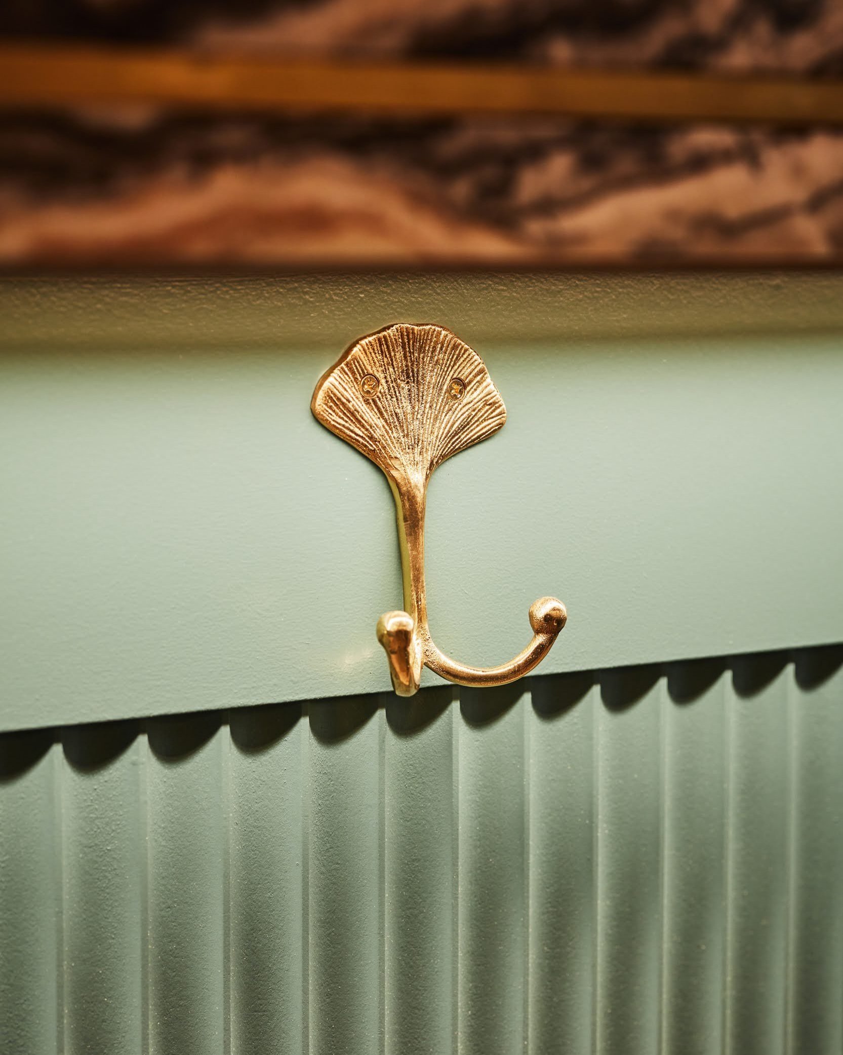
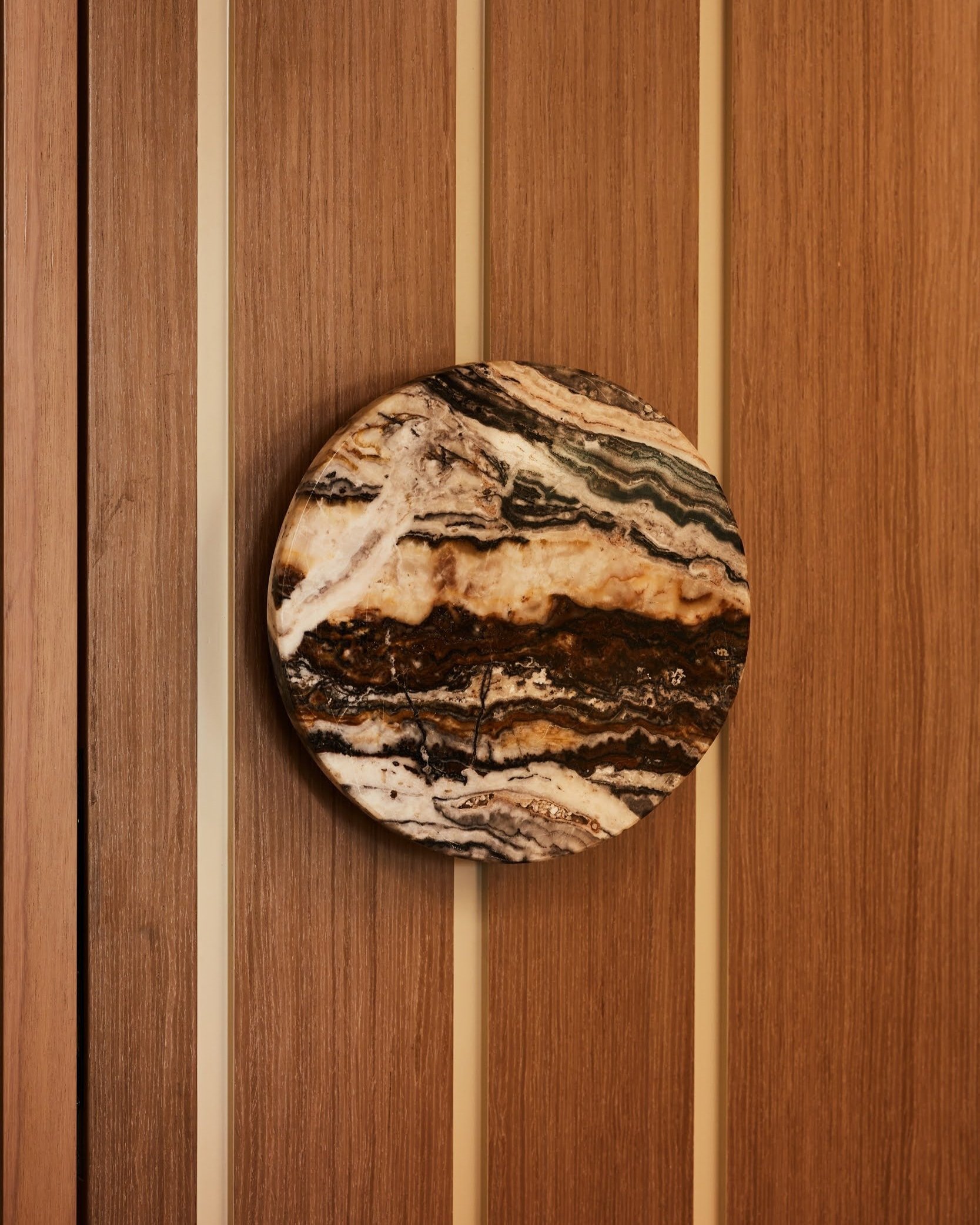
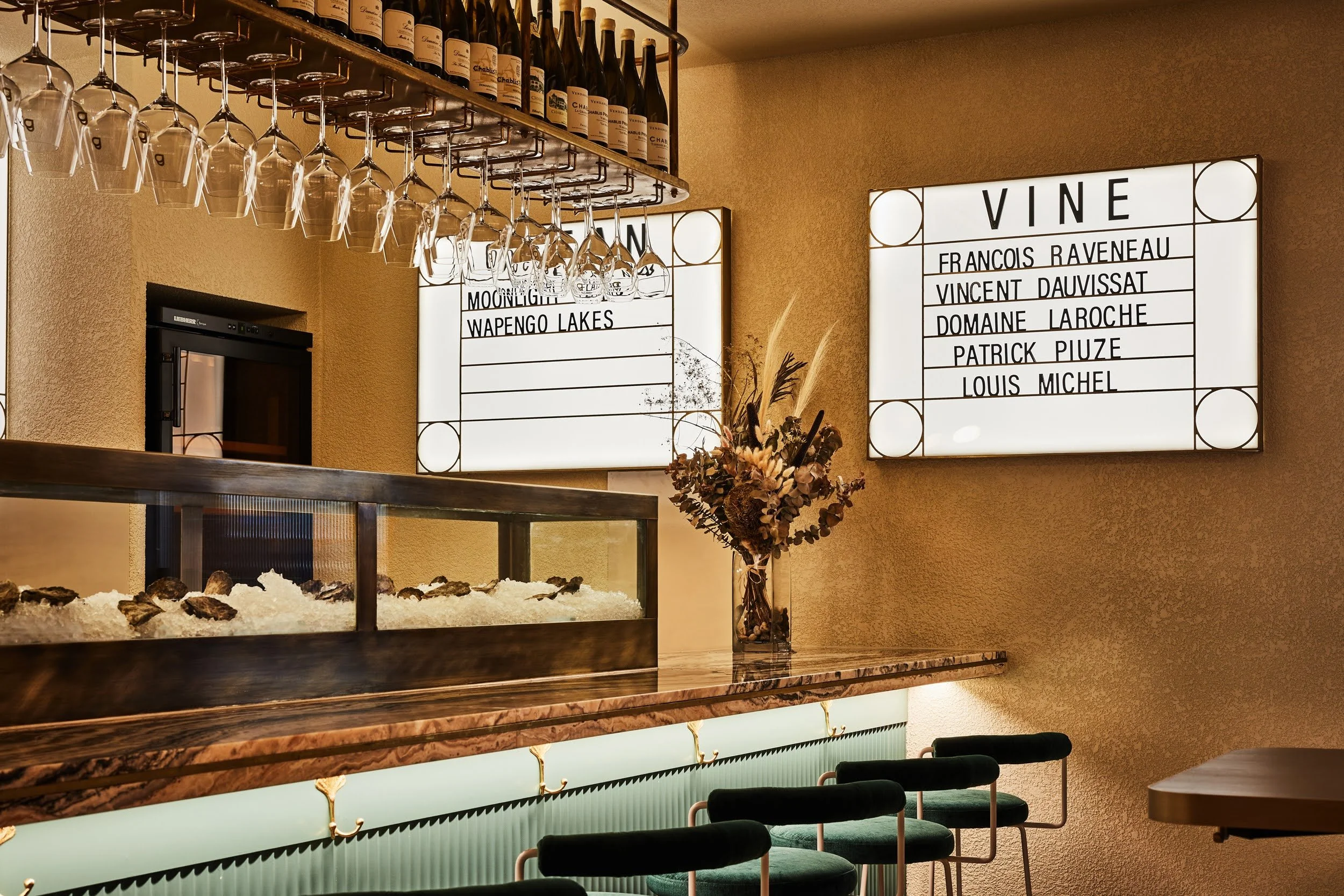
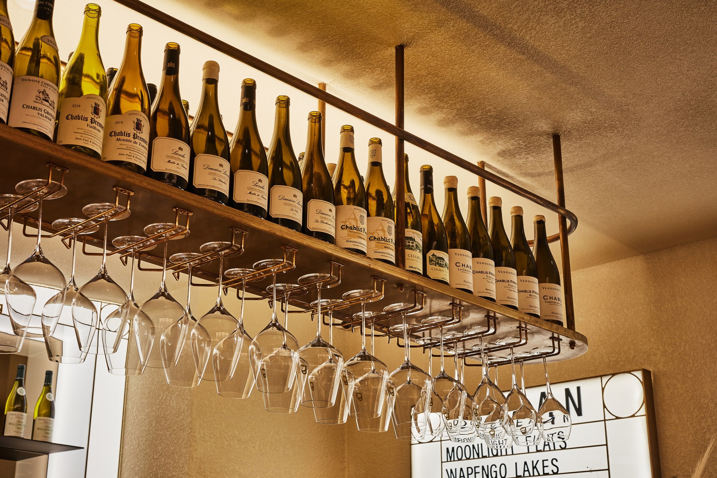
The base palette is buff beige with bold travertine crazy paving and rendered surfaces. Commanding your presence in the middle of the space is a Jurassic Travertine bar top that is reminiscent of the rocky surface of an oyster. If you are not perched up at the bar watching oysters being shucked in front of your very eyes, you are seated up against the fully integrated timber wine display where you can peruse some of the best Chablis in the world.

Outcomes
Already earning rave reviews from some of Melbourne's most respected hospitality guides and publications, Pearl has positioned its place in the heart and hearts of the city. Time Out's Eliza Campbell stating "...behind the curved wooden door is one of the most exquisite fit-outs I have seen in a while…"
Find out more: