
Ntegrity - An award-winning digital agency servicing Australia’s leading not-for-profit
CONCEPT, BRANDING, COLLATERALS
ntegrity is an award-winning digital agency servicing Australia’s leading not-for-profit, for-purpose and government brands. At the core of their vision is a simple aim - to help good grow.
The Brief
ntegrity’s brand was well established, but over several years, through countless campaigns, presentations and proposals, it had gradually become diluted and disjointed, and they contacted BrandWorks seeking to restore clarity. Together, we worked to simplify, unify and consolidate the ntegrity brand, as well as providing a clear set of guidelines for future use.

Typesetting
Challenges / Inspiration
We began with a comprehensive analysis of the existing brand across all touchpoints including proposals, reports, website and social media. We then held a co-creation workshop with the client to establish the key pillars and mandatories for the revised brand. One such requirement was the retention of the existing brandmark.
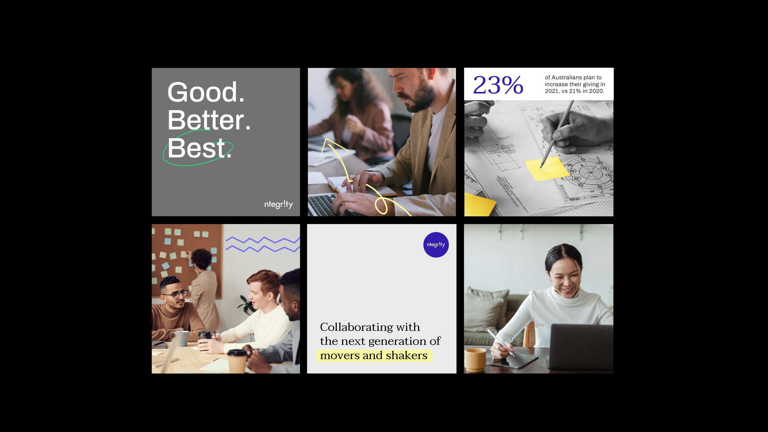
From here, and following discussions with the client, we set about developing the concept to form the basis of the design direction. With much of ntegrity’s work being results-based and data-driven, we developed a concept to showcase this information in the most engaging way.

Our Approach
We began with a comprehensive analysis of the existing brand across all touchpoints including proposals, reports, website and social media. We then held a co-creation workshop with the client to establish the key pillars and mandatories for the revised brand. One such requirement was the retention of the existing brandmark.
From here, and following discussions with the client, we set about developing the concept to form the basis of the design direction. With much of ntegrity’s work being results-based and data-driven, we developed a concept to showcase this information in the most engaging way.
The colour palette retains the company’s signature bold purple at the forefront, and pairs this with more muted, contrasting secondary colours which allow great flexibility for presenting data through graphs and charts, as well as text highlights and image overlays. Brand typography is clean, modern and easy to read, with a focus on large format callouts for key data and information at a glance.
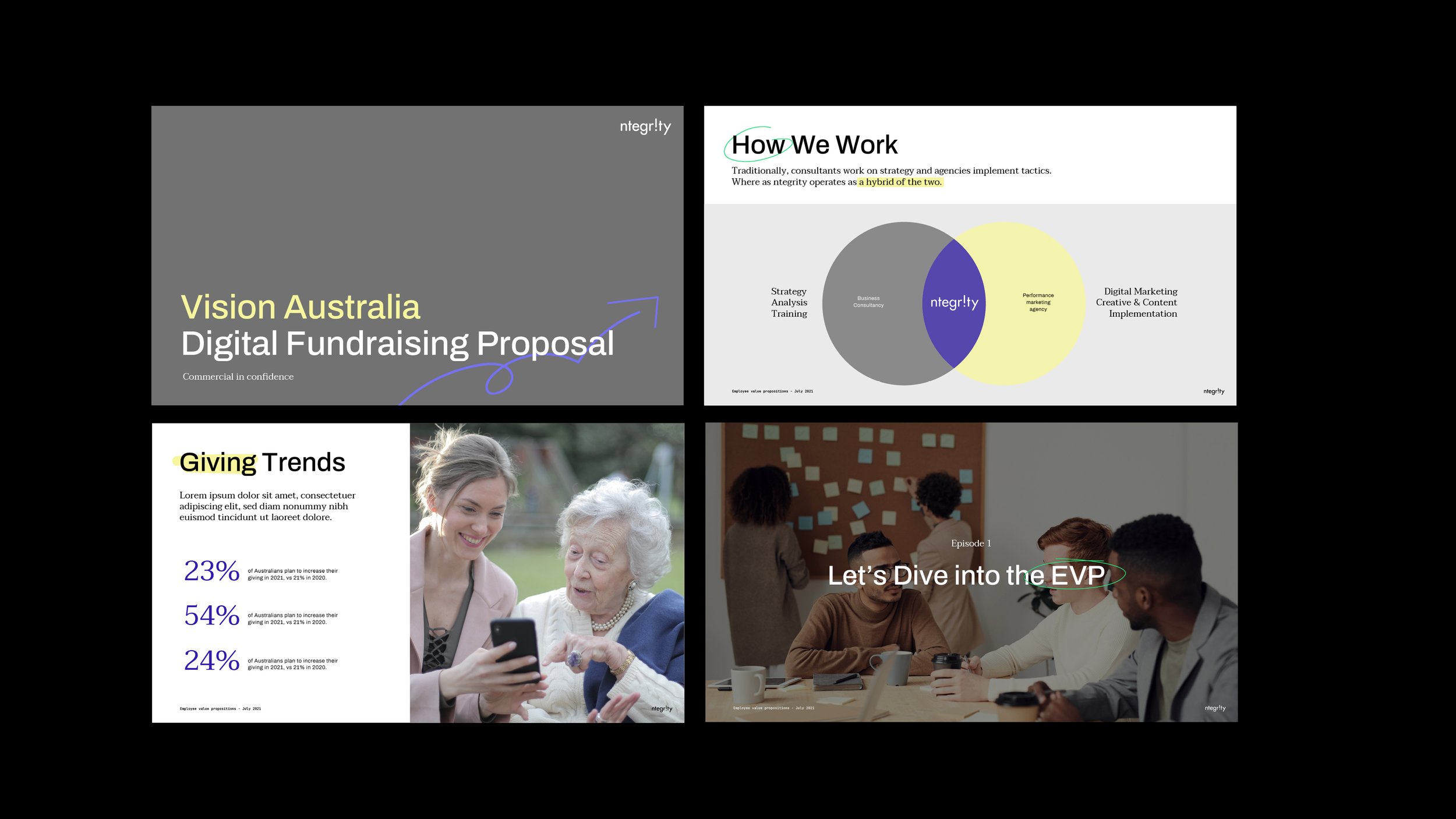
With the new brand finalised, we developed sample presentations and reports to showcase how it would work in real life scenarios, presenting real data and results in a way that is visually engaging and consistent. Finally, we developed a brand style guide document laying out a clear, easy-to-follow set of guidelines for the ntegrity team to ensure the new brand is applied correctly and consistently going forward, and so they can focus more on the important work they do helping good grow.