TOMA Brasserie
Strategy, Branding, Collateral

Image courtesy of Toma Brasserie
Where the classic meets the progressive,
the old meets the new.
Background
After two years of staying home most of the time during the pandemic period, Jakarta has adopted back its busy lifestyle. Many new establishments are born in the town, competing against each other, yet queues are still seen everywhere. This shows the thirst of Jakarta consumers that had yet to be satisfied during the lockdown period.
As one of the busiest streets in Jakarta, Sudirman plays its role as one of the prominent lifestyle and business areas. During weekdays, the area is packed with working professionals and business people. The area is also filled with families and health enthusiasts every Sunday when Car Free Day is held. Compared to the number of people who regularly occupy the area, the number of compelling F&B offerings needs to be increased. As a result, people need to wander a bit further to the South to find a culinary destination.
Hype Group sees an opportunity to create a destination at the heart of Sudirman to wind down after a busy day at work that can also be enjoyed during Sunday lunch.

Approach
The post-pandemic situation reminded us of the post-war era in the 1940s when there was a surge of excitement in everyone's hearts. People are swarming to go out and explore the city once again freely without feeling forbidded.
Inspired by this similarity, Toma Brasserie was born as a place where everyone can feel free to go out and be themselves, celebrating life and enjoying the moment.

Challenge
It has been proven that a similar concept attracts crowds in Jakarta. The market loves spaces that depict a classic high-end ambience with moody lighting and dark wood combined with velvety leather. This vibe encourages people to stay longer as the sun sets, and the conversation gets deeper as they sip more wines. The challenge was how to give an angle to the brand to make it stand out from its competitors while still maintaining a sense of familiarity.
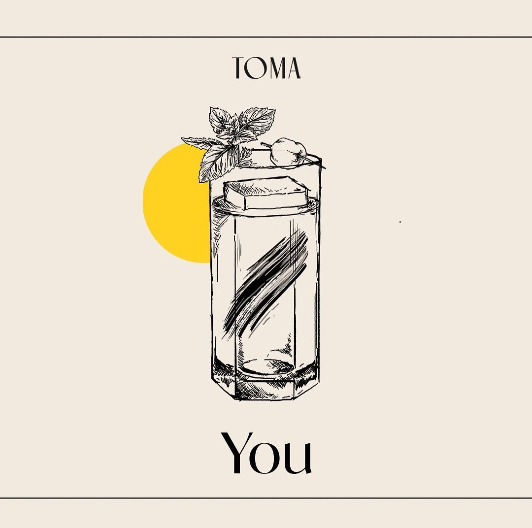
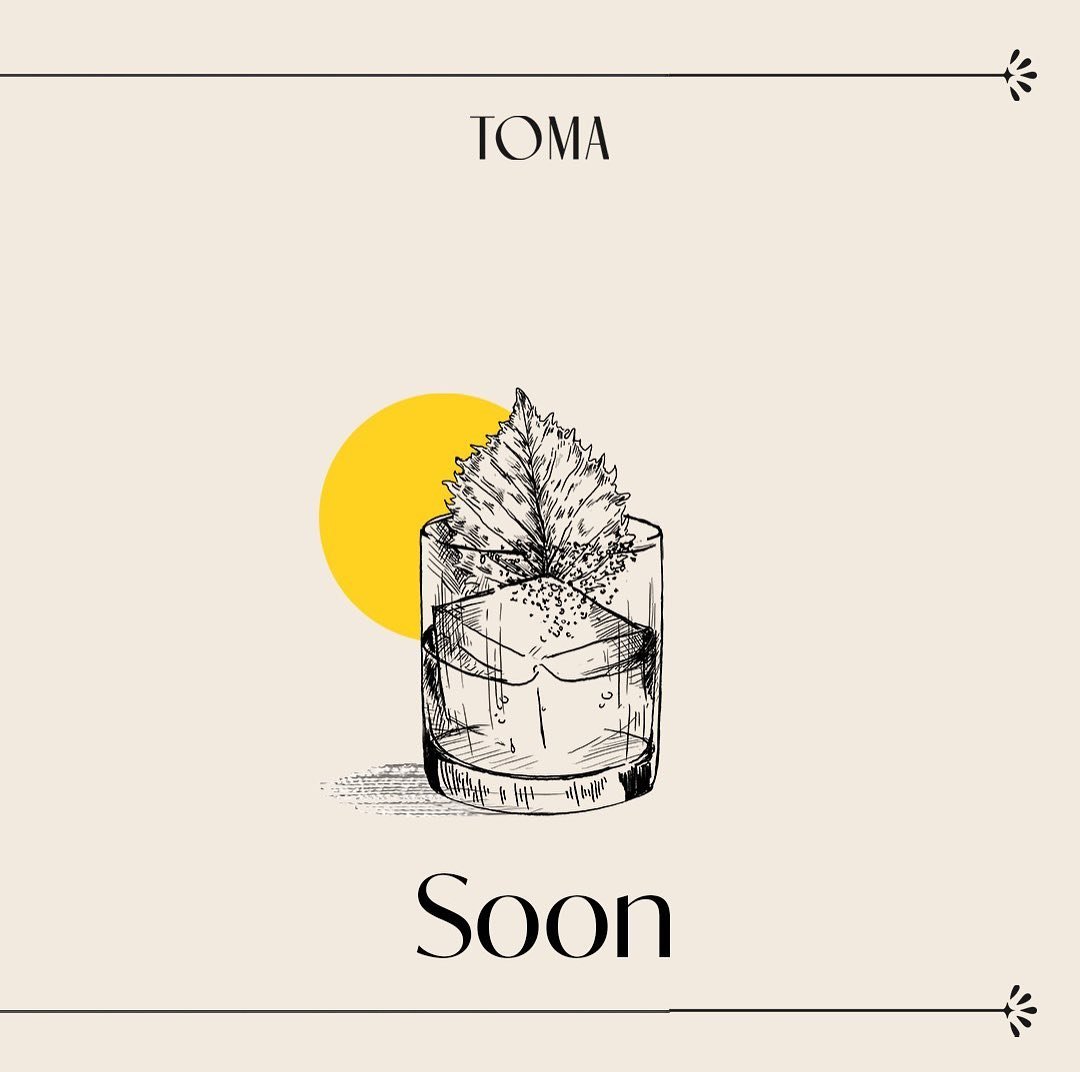
To answer this, we started by defining what progressive means. Toma is where the old world meets the new world. It is where the old is modernised, and the new is aged. At Toma, the lines are blurred, and rules are made to be broken. You will experience the New York of the 1940s infused with the interior, paired with progressive Asian dishes and a contemporary hip-hop tune.


Result
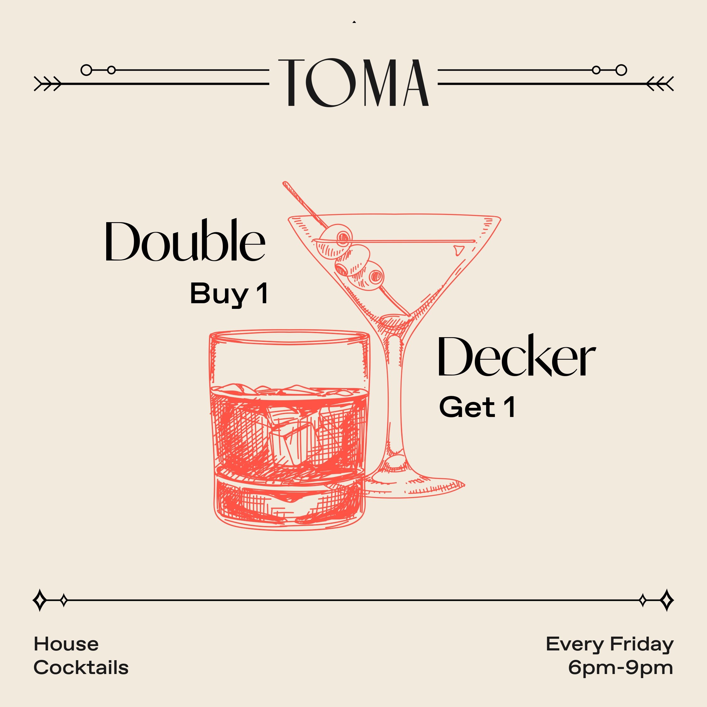
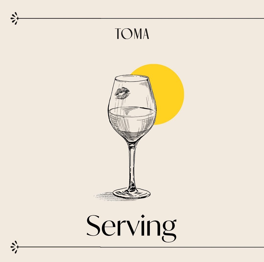
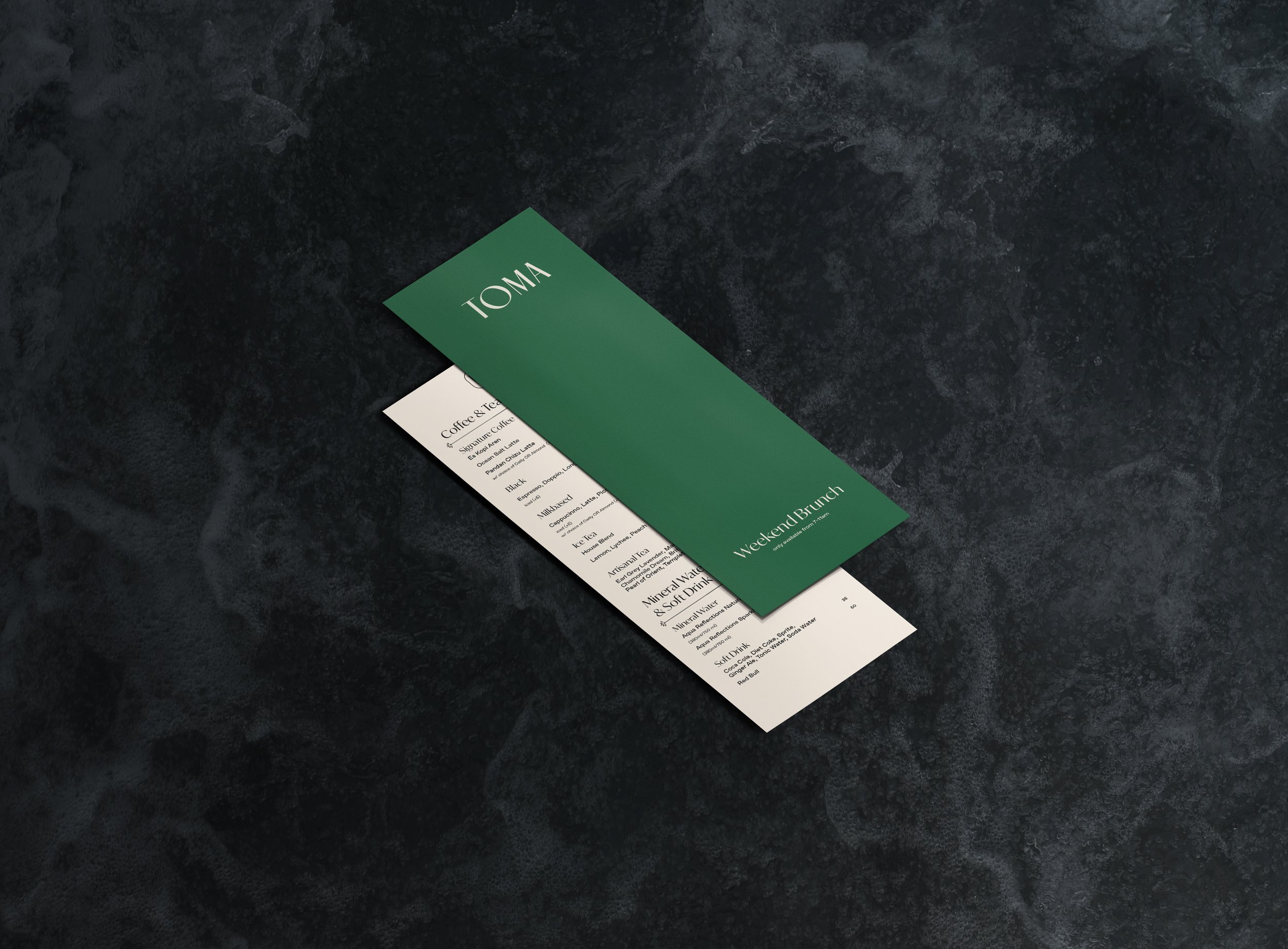
The brand identity is a spin on the old world. The brandmark and monogram resemble a monogram that was once widely used by gentlemen in the 1940s, giving the brand a sense of classic and elegance.
The hint of the new world starts to subtly show itself through the colour palette, where bright and striking colours complement the elegant colours. In addition, silver foil finishing is used instead of gold to communicate the elegance of the old world in a modern style. Black and white photography direction is used to capture the present time in an old way, and the collage technique is utilised to meld any elements from the past, present and future together.