MAHŌ
BRANDING, PACKAGING, DIGITAL
MAHŌ - Sensory redefined.
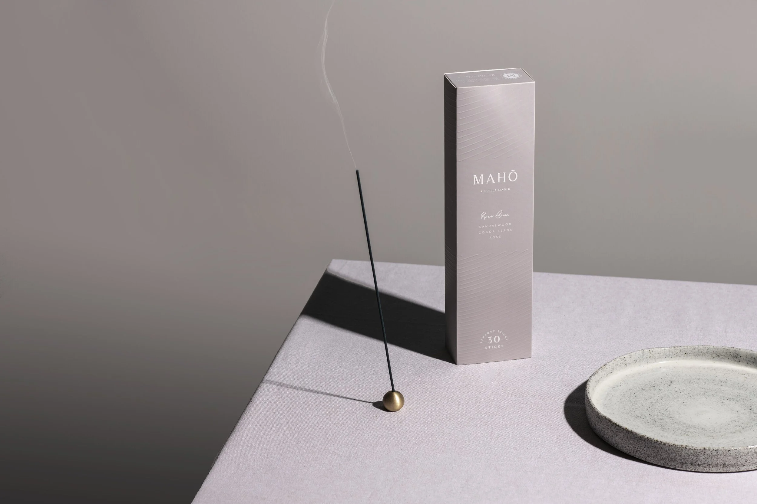
Honoring the ancient art of burning and creating a sense of place, Melbourne-based MAHŌ combines the natural, aromatic resin with a refined blend of premium perfumes. BrandWorks was invited to collaborate with the client to create a brand using its own design philosophy - to design using the five senses. The sense of smell and its transparency in bringing a little magic to one’s space provided inspiration for the name MAHŌ, which translates to ‘Magic’ in Japanese.
The brand’s position used the notion of sensory sticks in contrast to incense to provide a difference in market and the identity was influenced by Japanese minimalism and the art of rituals. As both an online and offline product, the brand and packaging needed to convey these values in an effortless way and leave a memorable mark in one’s mind. The brand mark symbolises this ideal utilising the typeface, Rasmus, inspired by classic serifs such as Times or Sabon, but features contemporary details. Balig, a signature pen script was chosen to compliment this direction.
Tactile embossing on the exterior to convey quality, a reveal upon opening and signature copy to elevate the emotion was designed to compliment the quality product. BrandWorks provided the strategy, designed the brand, packaging and website for a range of signature scents and scent holders. With a pure aesthetic and calming colour palette inspired by nature, MAHŌ offers a captivating addition to the rituals that create a space of meditation and coming home.
Image credit: Meagan Harding