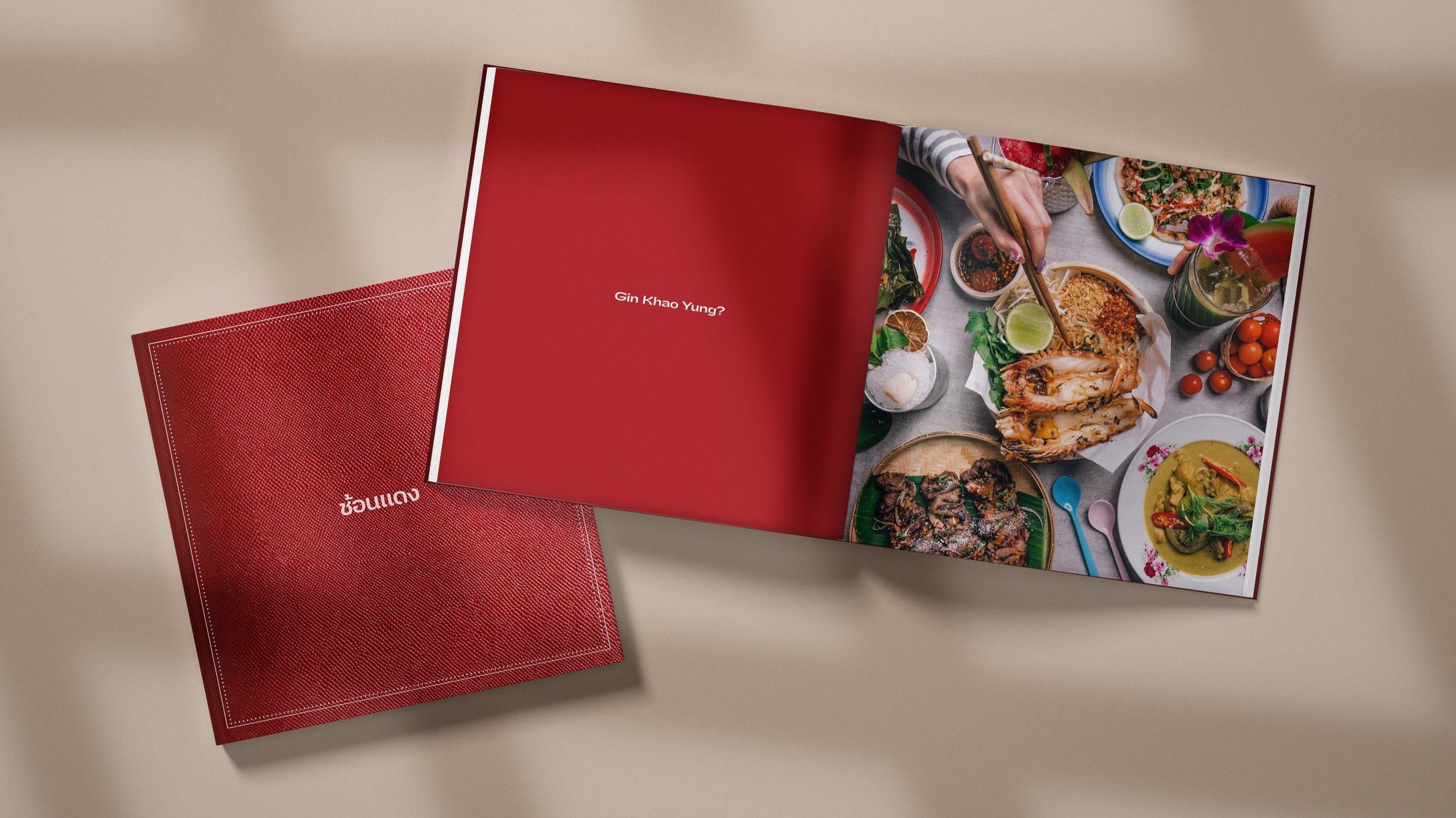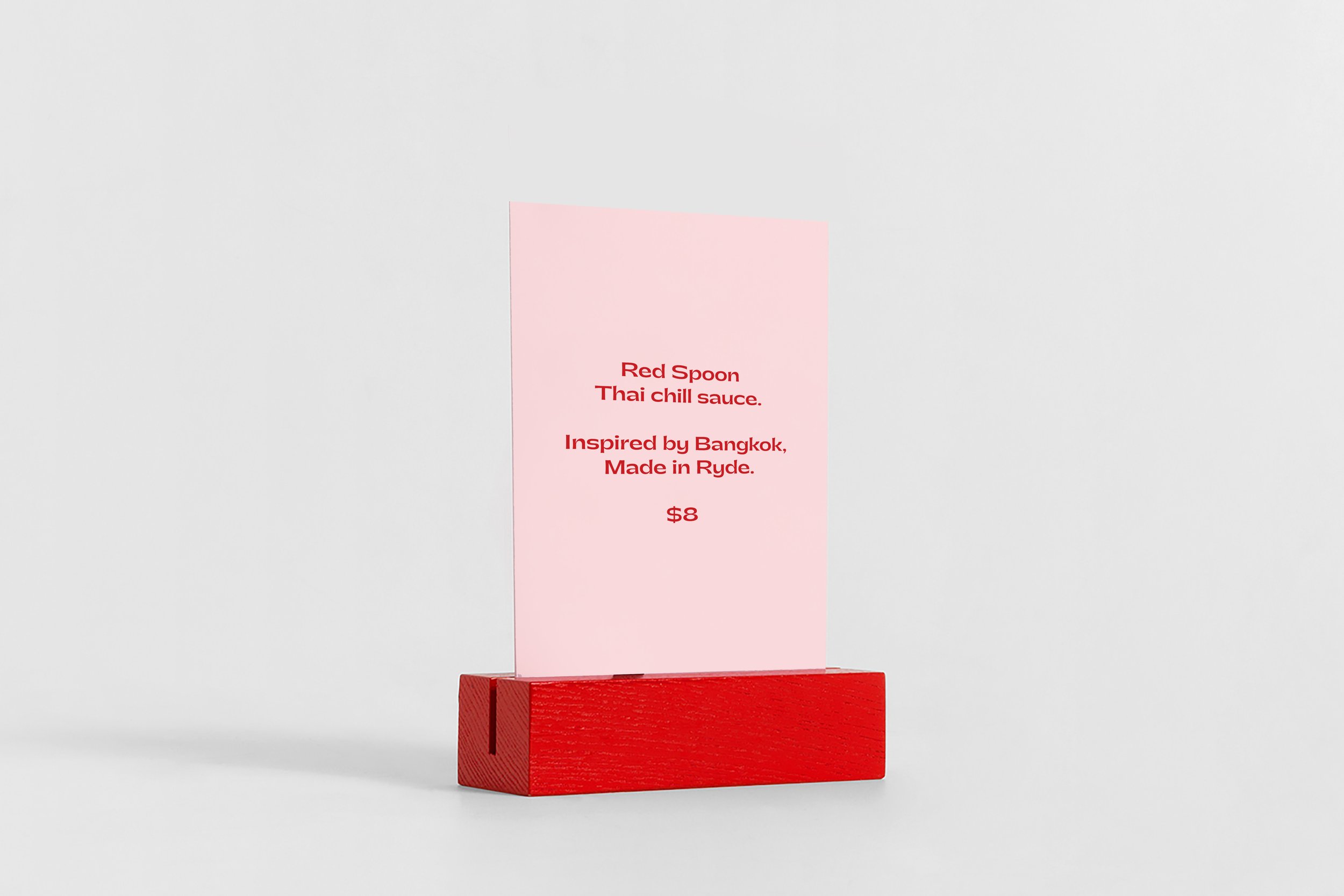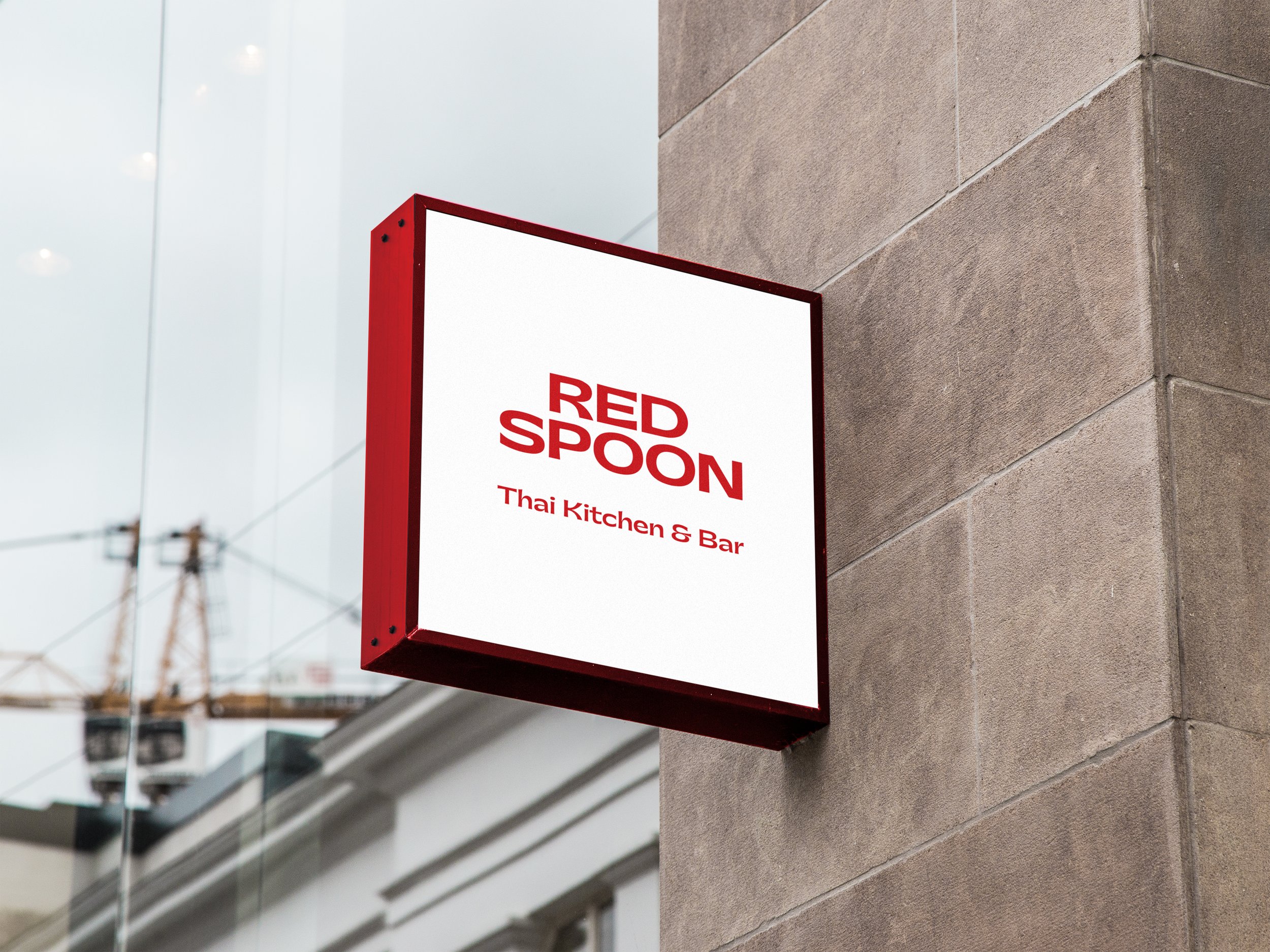
Red Spoon, Thai Kitchen & Bar
Ryde NSW
Strategy / Branding / Interiors / Collateral
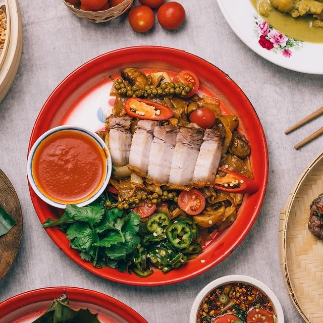
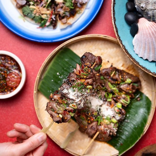
Spice up your palate to the edge
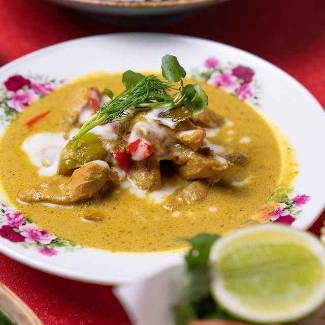
As an established and popular Thai eatery in Ryde, BrandWorks was engaged by Red Spoon to refresh their existing brand and interiors that embodied their passion for contemporary Thai Fusion cuisine. The approach was to create a memorable experience that blends authentic Thai cuisine, Asian pop culture with a casual dining setting.

Red Spoon begins with Thai’s seeing flavour as their spice.
“We don’t hold back and we never leave feeling hungry. We take our favourite childhood memories, our family celebrations and our love of Thai food and serve it up in a fun, no-frills ‘n casual way that leaves you wanting more. Red means luck and wealth, but it also symbolises love, passion and fiery chilis that make our food never dull. The spoon is the act of giving and generosity we have grown up with, we now offer to you.”
BrandWorks was engaged by its founders to provide a brand refresh and interior design for its existing location in the Top Ryde City shopping precinct, north-west of Sydney. Expanding its menu beyond Thai, the venue adopts influences beyond the Thai border to broaden its appeal with a food-centric demographic. Not taking themselves too seriously, the love of childhood memories, nostalgia and Thai pop-culture resonates throughout in a bright, bold and fun way. This care-free attitude found its way into the brand identity, signage and way-finding, collateral, uniforms and takeaway packaging.
Red is for spice, Spoon is for giving.